I chose this excerpt:
Option 6: The Night Circus by Erin Morgenstern
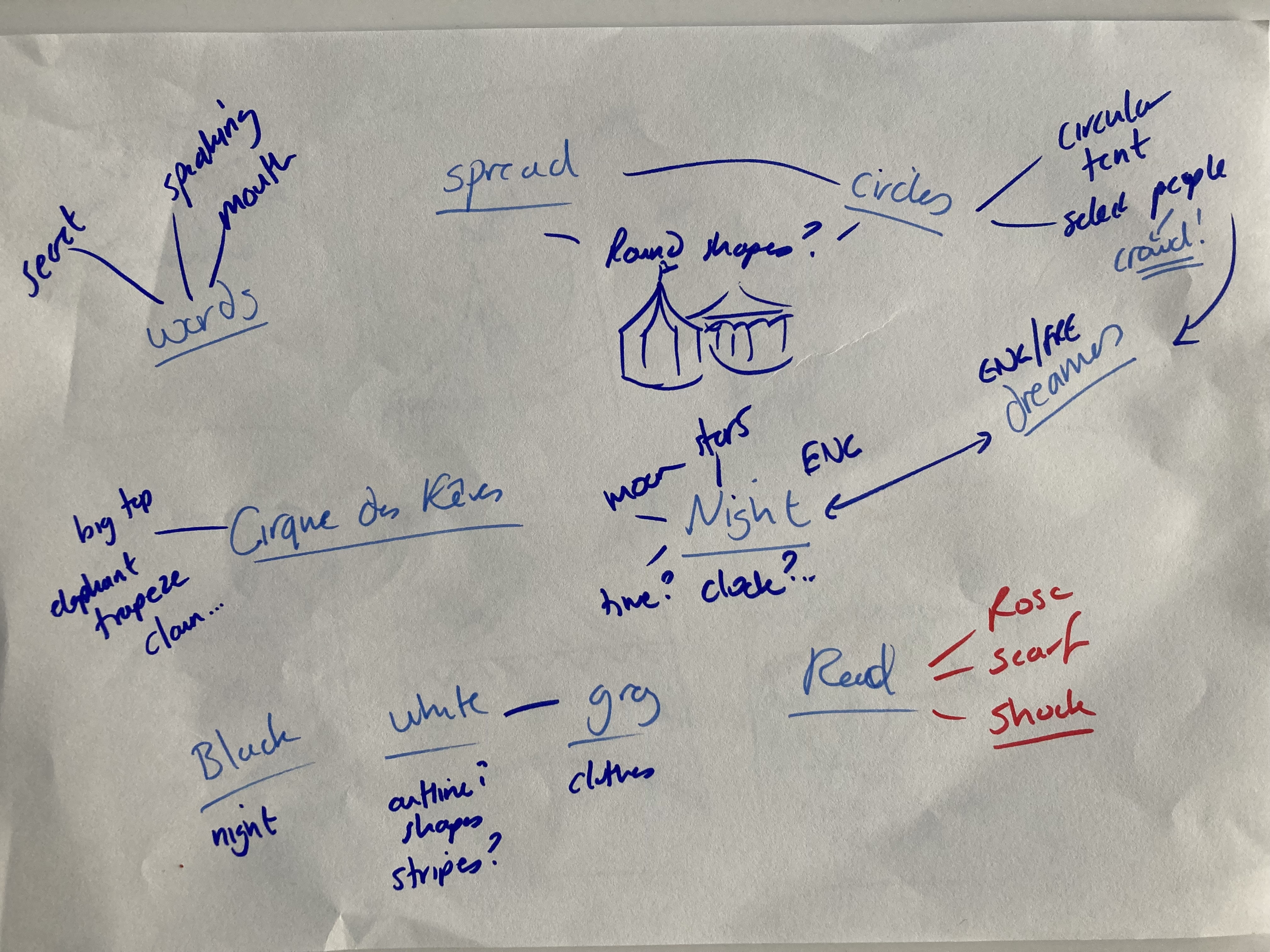
“Word spreads quickly in such select circles, and so begins a tradition of rêveurs attending Le Cirque des Rêves decked in black or white or grey with a single shock of red: a scarf or hat, or, if the weather is warm , a red rose tucked into a lapel or behind an ear.”
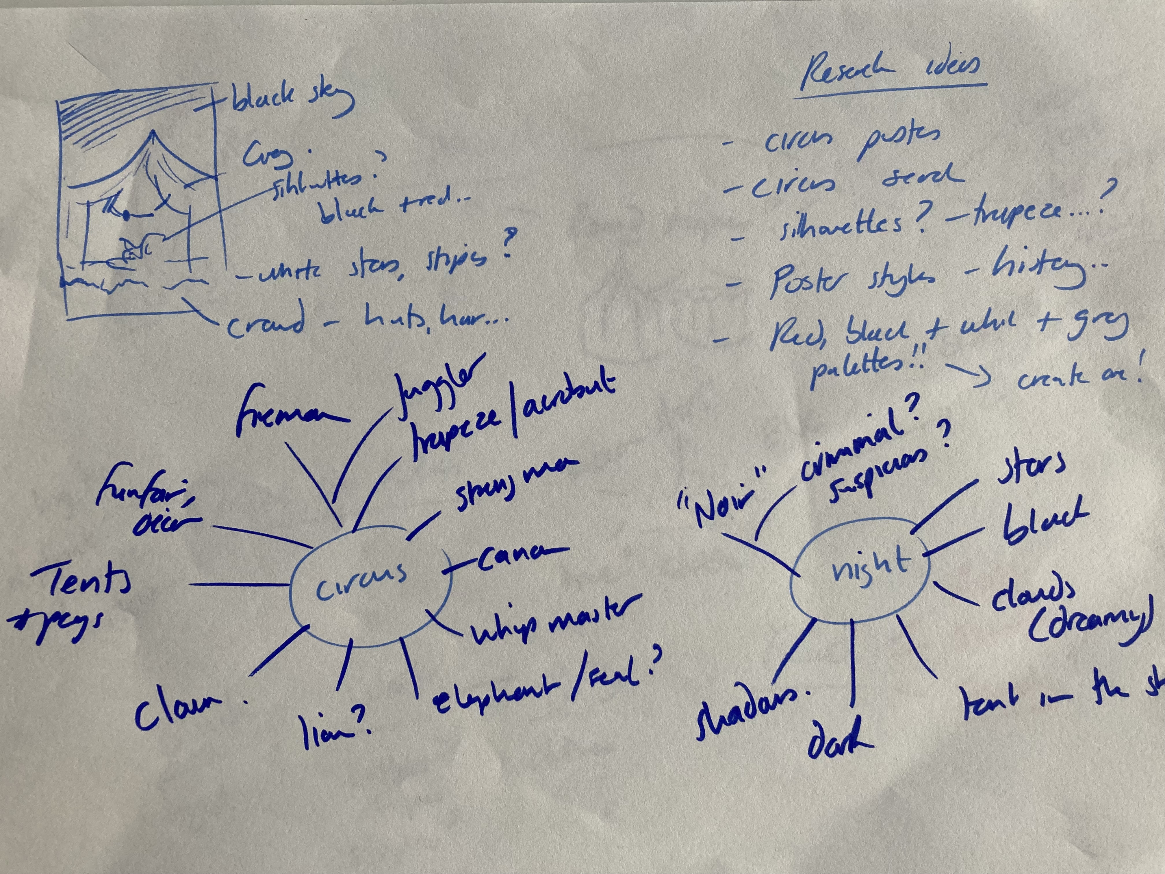
And I chose to design a poster for the circus using these colours and started my design with a mind map of ideas around the excerpt:


I then made a mood board in Pinterest searching for circus posters, circus inspiration and posters link here

I also went back to the Pantone colour palettes to trial some blacks, greys and reds together. I was thinking of how to pick the right red accents or maybe use different reds – brighter and more playful or darker and more mysterious to go with the night time theme?

I decided to try more for a duskier red and darker greys to get a darker more mysterious mood:

I then worked on some thumbnail ideas for a composition bringing in some of these elements together: I went for using the iconic tent and given the night aspect, the greys blacks and red this made me imagine more of an elegant, mysterious style of circus and rather than jugglers or animals, I wanted to do an elegant aerial dancer or trapeze artist – also noting that not many people like to see animals. So on that basis I played around with ideas for composing this as per the below:
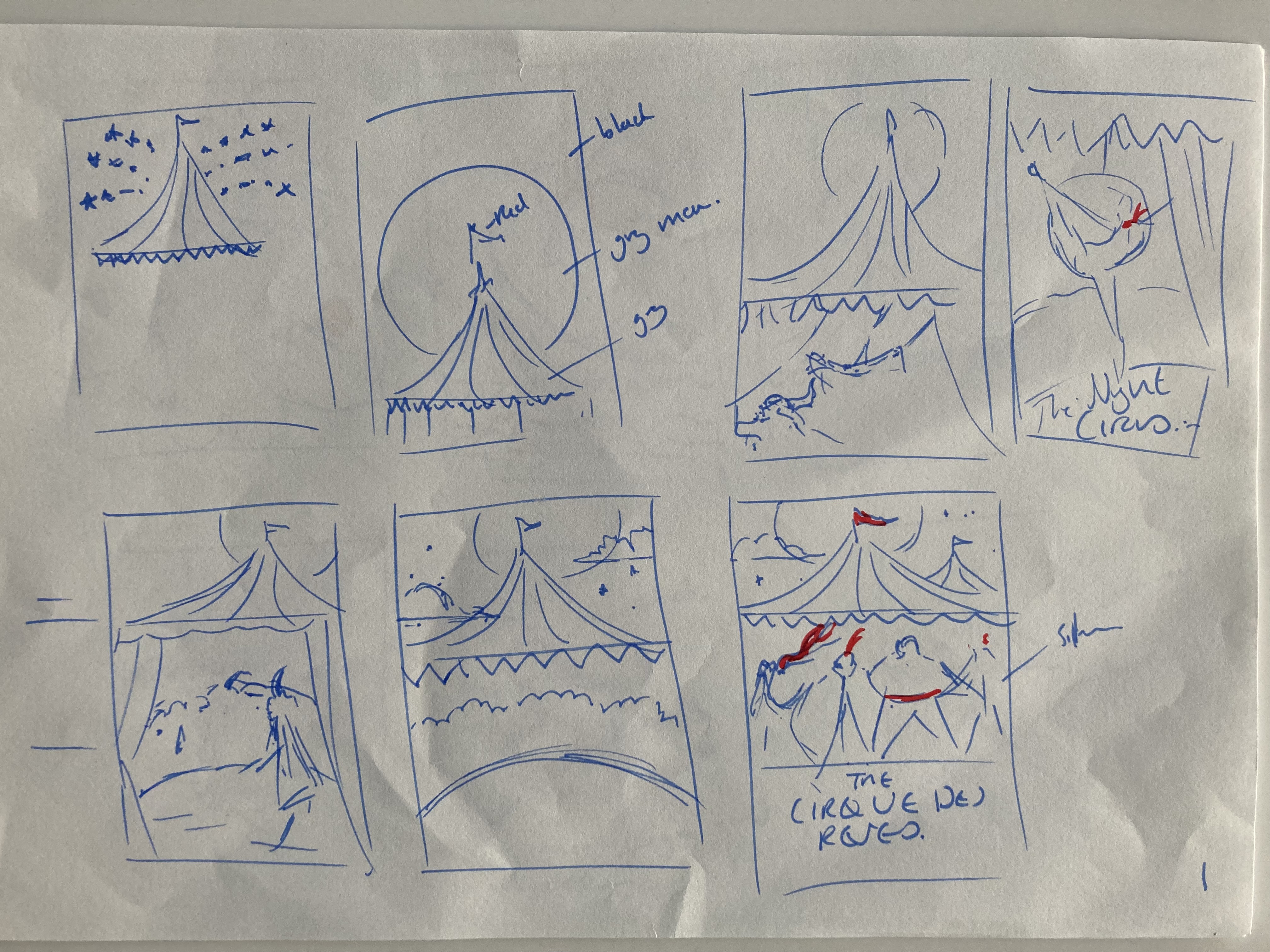
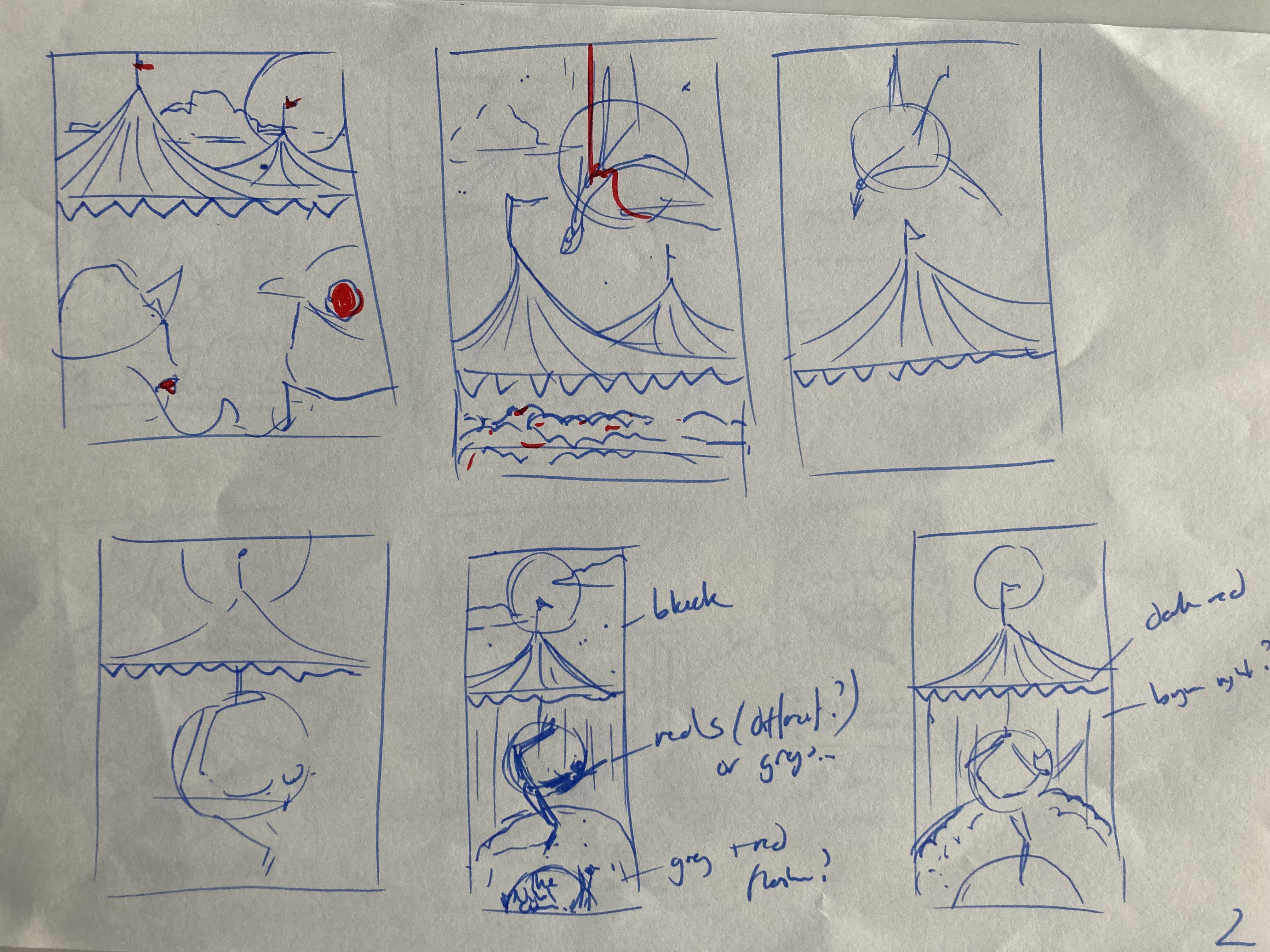
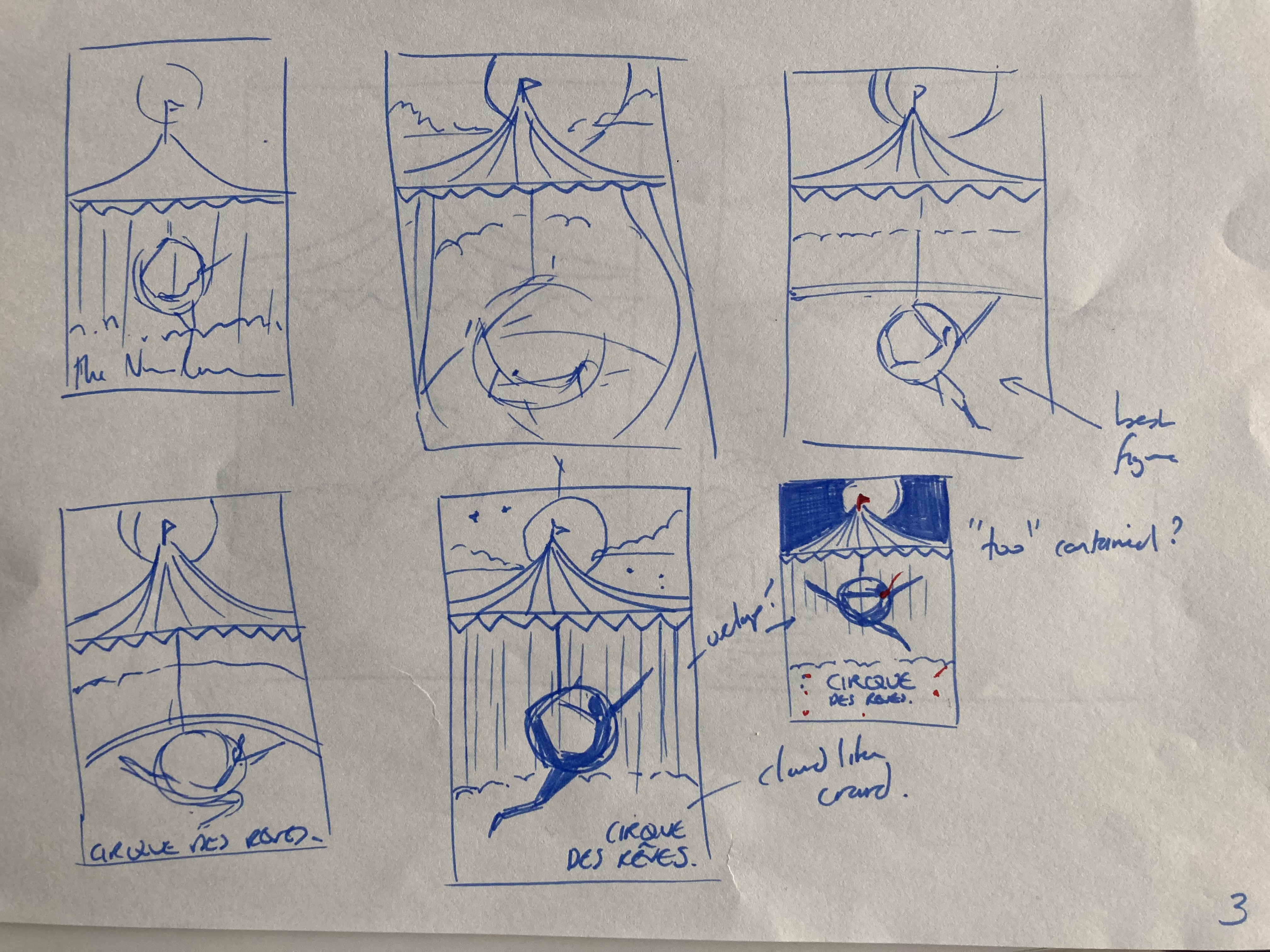
I settled on some kind of aerial dancer being seen through the flaps of the tent and showing the night sky above it with the moon. This would give me the chance to use different greys, blacks and whites and have a nice contrast with the moon as white against a black sky and the silhouette of a dancer against the lighter interior colours.
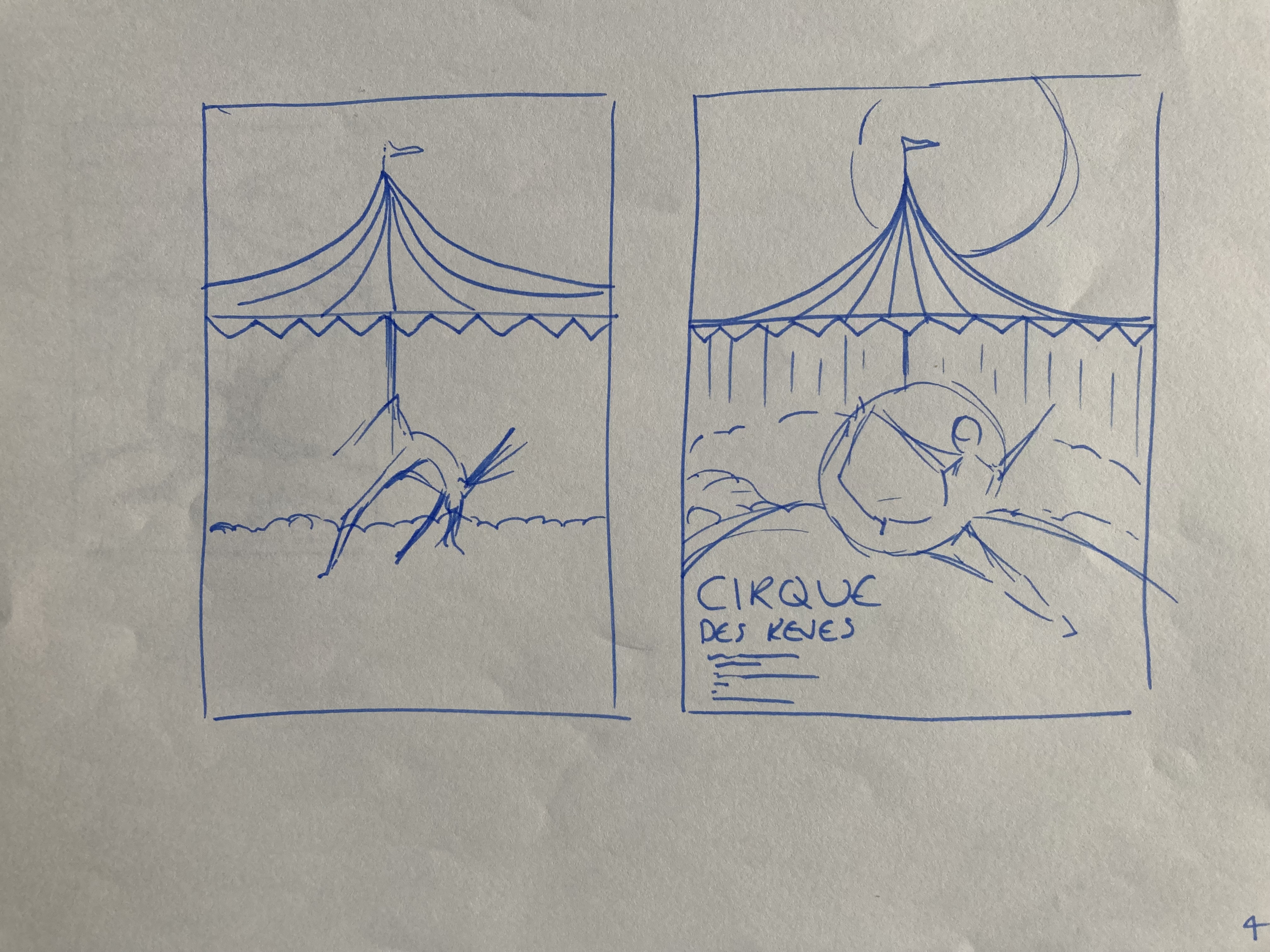
I got to this point and decided to experiment on Illustrator and then In Design for text. I found a nice stock image to buy and created the main image on AI (bottom right).


I then went to In Design and AI again to add flaps and play around with text and colours – I needed one flash of red but I chose the material rather than the hoop so I could get a flowy red that ran across the page so that I didn’t need other red parts elsewhere and so it was a central attraction to the eye. Here is the final poster, complete with text for dates and place.

Reflections:
- I’m not yet an expert on AI or ID and fortunately I also like simple and striking rather than too busy so I went for a simple poster to also allow for a striking main image.
- I think I managed to get the contrasting colours I wanted: greys and blacks against whites and reds – night above the tent and light and silhouette inside the tent.
- The proportions are obviously skewed but I think this is fine particularly because its digital
- I realise the the texture of the clouds is perhaps too distinct from the rest of the poster and retrospectively I could have left it simpler with just the moon and stars – or even added more tops of tents to help fill against the sky and at the same time I wanted the clouds to reflect with the ‘reves’ aspect which means dreams in French.
- I went for a richer crimson / pinkish red again because I think its richer and more elegant for the feel I wanted and slightly more serious and romantic than maybe a circus tends to be but then this is the image I had from the colours and the fact that it’s at night so it makes me think its more for adults, more like going to the theatre, elite etc. at least from the excerpt that’s my feeling.
- I also considered making it narrower to add more height and slightly different page though posters don’t tend to be. Pending inputs from my tutor I may make more edits.
