For this exercise I chose to draw a mixture of objects related to having a cup of tea: a mug, teaspoon, kettle and some bags and a tin of loose-leaf tea.
I thought it would be useful to try some brainstorming first around what a tea ritual means so I could decide how to better plan the drawing, the medium, the style I would try. I do love a cuppa and I have everything from black through to green through to infusions of nettle and thyme and lavender. For me tea is a comfort, its relaxing, its warm, reliable and sometimes good for a moment of reflection. I tried to think of related words around this to get me in the feeling of how I have tea, while also having a cup!
Then I made a list of effects or feelings I could portray in the drawing:
- dreamy
- blurred
- textures
- quiet
- soft
- careful and tidy
- warm and natural colours
- gentle
- not too dark either
- maybe use brown paper to get a more rustic warmth rather than on white
Then on to potential media that would help me capture some of the above, deciding to stick to light, quiet, soft and dreamy:
- pastels probably would work best
- oil pastel might be too textured and bright with colour
- water colour could work but I know I have a tendency to really lay on the colour with paint, even with watercolour so I think I need to work specifically on using watercolour more at another point


I opted for pastel and found a roll of brown wrapping paper since I couldn’t find the brown colour I wanted in A2 at the art store. I made an A2 size of it and taped it to a studier white cartridge paper. I realised that this meant there wasn’t much tooth to the paper but decided that it would be good to see what came out of it compared to the grainy paper I used for my previous assignment. I realised afterwards that this also makes it harder to layer colours but since I was going for light and dreamy, this worked to my advantage.
Things I need to try to watch out for based on what I had learned in part 1:
- Tone for objects in front of others – to avoid a weird dynamic where it looks like one is wrongly wrapping round the other
- Being more careful with perspective and ellipses since I tend to draw realistically
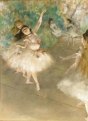
I then looked for some inspiration from other artists. I went to one of my faves: Degas and his pastel ballerinas with their floaty tutus and lesser known landscapes – very soft and dreamy! What I like is how he used pastel with small marks in places that blur or to suggest movement or soft edges. Since my mark making in pastel has usually tended to be smooth and rubbing in, I wanted to try to emulate this more in my drawing to get a bit more character while still staying soft.


I also googled around and found a really interesting drawing in pastel by William Merrit Chase where the edges were not straight or to a certain extent bended in different directions despite the form being very precise and the mark making to give tone and light was quite organic and squiggly.

I also really enjoy the messy yet purposeful mark making while using thicker and thinner pastels and strokes for large areas or finer detail. I wanted to try to also capture that to a certain extent.
I tried these effects out on some brown scrap paper without worrying too much about the perfect outline. I definitely could not quite figure out the blurry edges aspect for the cup though now that I am reflecting, I think it might be more related to the scale being used. I tried blurring with my finger but at a bigger scale its probably more about the mark-making. Noted for future reference!

I like how the teapot came out with chunky mark making with marks that gave the round impression and using different tones of grey and white to get the light. I discovered here how much you can actually layer pastel and even put lighter on top of darker and what kind of effect that makes which was interesting!
In arranging the objects to be drawn, I played around until I got a nice set up, ensuring some objects were in front, and that angles were different so I could really practice the drawing aspect. Using my sketchpad I also tried to really study the set up to understand the objects better. I also tried a higher angle out to help me better understand the elements. This was really useful to get a better sense of the form of the objects and the areas where I knew I was going to have difficulty: proportion of the kettle handle to the kettle, the kettle spout angle and the tin of tea in front of the kettle. And my expectations were right! But that meant I knew I had to spend a lot more time on them and thinking about how to get them right. This is actually good for understanding how to fill the page with the objects or at least that was what I was aiming for from a traditional still life sense.


I then tried to map out the order of how I drew objects so I could get the most realistic composition, I tried marking out the darkest tone and then even tried to plan how i could use some of the different measuring techniques outlined by Juliette Aristides in her book ‘Classical Drawing Atelier’ from the course reading list to make sure I got the proportions right (comparative and relational measuring). Each time I was checking and placing the objects in a more accurate position so I could get the more realistic composition.


By this point I just wanted to start drawing so I got set up and even used, for the first time, grid lines so I could get the composition I wanted in the page. I figured that starting with the largest and most central object was the best idea as from there everything else was a reference though I look forward to my tutor’s advice on that. With the grid lines splitting the page in six and also having a central vertical line I was able to place the kettle where I wanted it and still have the right space for the objects around and in front. I found this really useful as previously I would work more intuitively and using a viewfinder in my brain or using my hands and a ruler to squint at the objects.
Using my planning of proportion and distance and placing of the other objects I then worked around the kettle to get the rest. This took me longer than I wanted but I really also wanted to try to work on the perspective, proportion and angles and I think this worked a lot better than my assignment 1.
Some observations and realisations as I worked in the pastel:
- I need to get feedback from tutor about tone and colour. I almost think that I work better in colour to get tone but I would have expected it to be easier in only one colour?
- Less tooth or smooth paper is harder for pastel to catch but it also allows for an opaque mistiness that I quite like – unintentional discovery that worked well for the look I wanted!
- Layering light on dark or vice versa gave a lot more character – practice more!
- First layers always look bad – be ok with that and work in tone and colour and then do finer detail at the end which brings out the form.
- Objects in front of each other: think about the form of the object behind and make marks as if the one in front is not there, rather than shade ‘around’ the object in front. This helped me do a better job this time.
This is the final product:
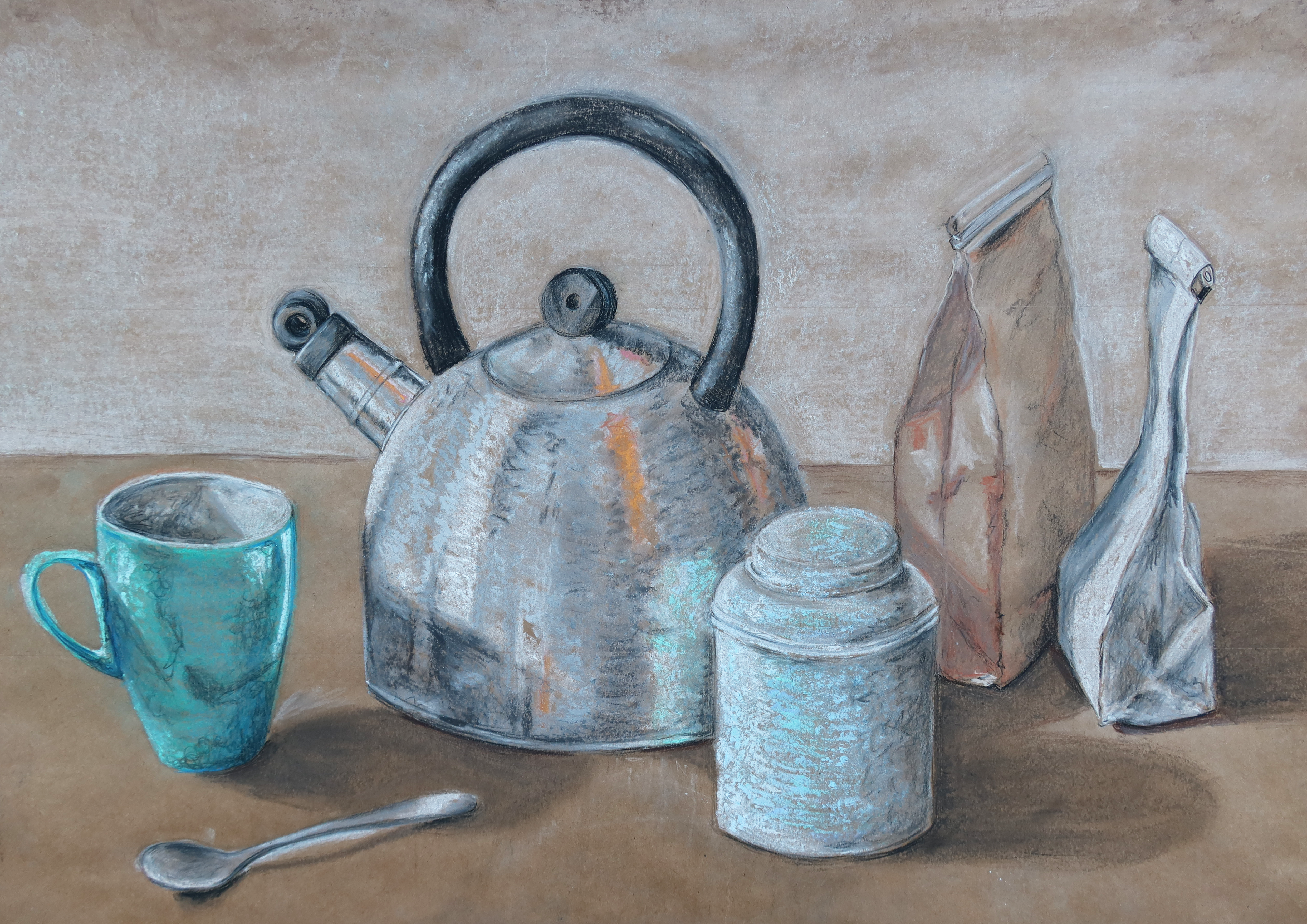
Since I was drawing man made things, to compare with Degas’ landscapes or the portrait is difficult. I think that I still have been very precise in my style with clear form and edges while experimenting with movement and mark making that had more movement. The kettle in particular had so much to play with and colour reflections that I found this the most interesting and easiest to experiment in this way.
I really enjoyed trying to apply the more squiggly finer lines to give tone, similar to the portrait which I think worked really well on the cup in particular. This is probably because it was so shiny and a dark jade colour so the highlights work really well.
Now also realising how different the shiny cup and kettle and spoon are compared to the other three more matt objects, I am unsure if it makes it look like I have applied styles that don’t quite come together or that is works to be realistic in terms of the real texture and tone of the objects. I think I could have worked more tone into the front tin though the colour was very light so I perhaps struggled with that a bit more.
I think I achieved a soft and dreamy look though I wonder if I should have toned down the black parts of the kettle even if in reality they were very black. It might have helped the atmosphere. Using brown paper worked really well for the kind of warmth I wanted, particularly since it was very smooth so a lot of that brown comes through the pastel.
Quick notes for reference:
- Gridlines work well for me for composition
- Reminder to also trial layering pastels on paper with more tooth to test that effect
- Reminder to study more tone in colour
- Reminder to keep stepping back and look at the overall tone and relationship with colour so I can keep working on getting that holistic tonal aspect that I need to learn.
- Don’t put tone around the object in front, work on the object behind.
References
Edgar-degas.org. 2021. Edgar Degas – The Complete Works – edgar-degas.org. [online] Available at: <https://www.edgar-degas.org/> [Accessed 8 August 2021].
Jordan, C., 2021. Pastel Art by Some of the Most Famous Artists of All Time. [online] Artists Network. Available at: <https://www.artistsnetwork.com/art-history/pastel-drawings-famous-artists-time/> [Accessed 8 August 2021].
