For this assignment I was to apply what I had learned from the previous exercises to do a study of a collection of objects from around my house or garden. After wondering around and around in my flat, I settled on what I think is the most interesting set of things to draw within my very old fireplace which still has the old tools to manage wood or coal fires with. I really like the dusty and rustic look of this set of objects and given the dark corner they are in, I thought this would be good to experiment with tone and really get into applying dark tones and being less afraid of using the full page and covering the white of the page which I think I tend to do.
I first made some sketches and viewpoint ideas in my sketchbook as per the below. I tried some vertical and horizontal viewpoints and different angles from higher up to lower down vision and zoomed in and out a bit to see what I might prefer. I decided on a vertical set up to really fill the paper with the candle holder, brush and shovel very clearly while still allowing for the height of the handles of the latter two objects to run up into the top left corner of the fire place. I was hoping this would be both a nice composition and allow for a lot of varied tone applications.


I then used my camera to take a few shots of what I was imagining so I could really fit it into the viewpoint I wanted as per the below:


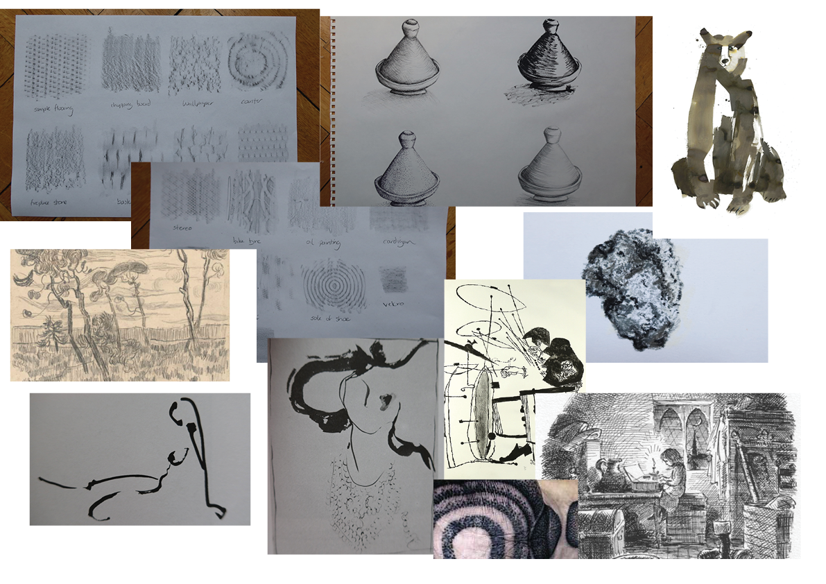
I also jotted down some ideas on how to apply the tone, and questions to ask myself like if I wanted to use white or dark paper, what media and where to use stipple, hatch or general tone to get the effect I wanted. I don’t have easy access to a printer and I am still working from home due to COVID-19 so rather than stick up inspirational drawings and sketches I had analysed or collected, I created an online moodboard of the same to keep by me to refer to and to use to think about the medium and approach I wanted to use. Some of this was from previous artists I had looked at and who I admired for their use of hatch, tone or dramatic outlines. I also put up some of the previous investigative work I had done and some of the images I used in the previous two exercises within this course and came up with the below. I tried to be varied in style and method for creating tone.
After mulling over the sketchbook, the above digital board and the instructions again, I decided to try to keep the quite rustic look the fireplace has and to use a combination of pencil, charcoal and pastel on a grey piece of paper given that the scene is already rather dark and I thought this would give a richer effect. I also believed that it would help me move away from being shy about putting too much tone onto white paper as I feel that I sometimes do.
Here is the set up I created for my work, lowering my easel to the further point to get the viewpoint I needed and using the floor to kneel on or the small stool. I kept the eisel to my left and the light coming from the right, experimenting with the natural light or closing the window and doors and using the lamp light for a softer light. I settled on a lamp with a half covered window.

I started out with using a white pastel to give me the basic outline of the drawing. It actually took me some time to get all the angles right and the proportions. I ended up erasing and starting with different points to try to get the set up right, placing the ‘corner’ of the fireplace first in the background and then trying to gauge the size and distance and proportion of the three main objects. The below isn’t the final drawing as I kept playing with the shovel to get the right alignment of the handle with the angle of the shape, it was definitely the most complicated piece.

While not exactly the same application was used, I was inspired by the round hatching of the pine trees in the analysis of drawings so I first started with the back of the fireplace and the extending circular shapes using large curving hatching lines built up on top of each other, alternating between lighter and darker to get the 3D effect of the contour. I used base tone with the sides of pastels and charcoal and pencil to get the stone floor and sides but then added random and chaotic cross hatching and lines on top to give the old effect, with some light stippling to show the scratch matches. I used my finger to smudge some parts to give the effect of coal marks and then finer pencils and charcoal to get the light and dark detail of the joining stone at the bottom and under the objects to ensure contrast.
Similar to how the surgeons/artesans in the analysing images exercise where faded and shadowy, I tried to apply the same blurry edges to the top part where the shadow of the mantelpiece hit the top of the handles of the tools and the left top side of the side wall.
I also used very light and fine hatching for the twisting handles of the tools that caught the light and dark very effectively. For the candle holder, since it was both dimpled and shiny as it is glass, I used the sides of pastels to get a grainy stipply effect and added lighter areas where it was catching the light. I also tried to fade the sides into the background as this was how I could see it in reality while still trying to give the definition to the sides with ever so slightly darker black.
I came to the final piece below:

For the shadows I didn’t draw any outlines, as advised, but did a light cross hatch and rubbing to get the shadowy effect which I think worked well. The bristles of the brush were hatching to mimic their form and simply pressing harder or lighter to get the shadows and thick effect.
I certainly have never applied different techniques so consciously to get tone in a drawing and I quite enjoyed the experience. The fact that I had explored different techniques made them more accessible to me and I went even beyond those I used to try out different things like rubbing, random marks, hatching and the side of different media to get different marks. I particularly like the way the candle holder has turned out as I find it really representative of the real thing – building on the pastel on its side and the grain of the paper to give a dimply yet reflective effect. I have also never been so daring nor worked at such a large scale so often so I found the capacity to play with the media even better when working at A2 and I surprised myself at being able to fill the entire paper progressively and really applying a lot of tone and hatch. I am still a little unhappy with the angle and alignment of the shovel but I guess that’s practice to get that right. I tried so many variations and this was the closest I could get to at this time that I was happy with.
I look forward to the insight of my tutor to see where I can improve and on further ideas to learn!
