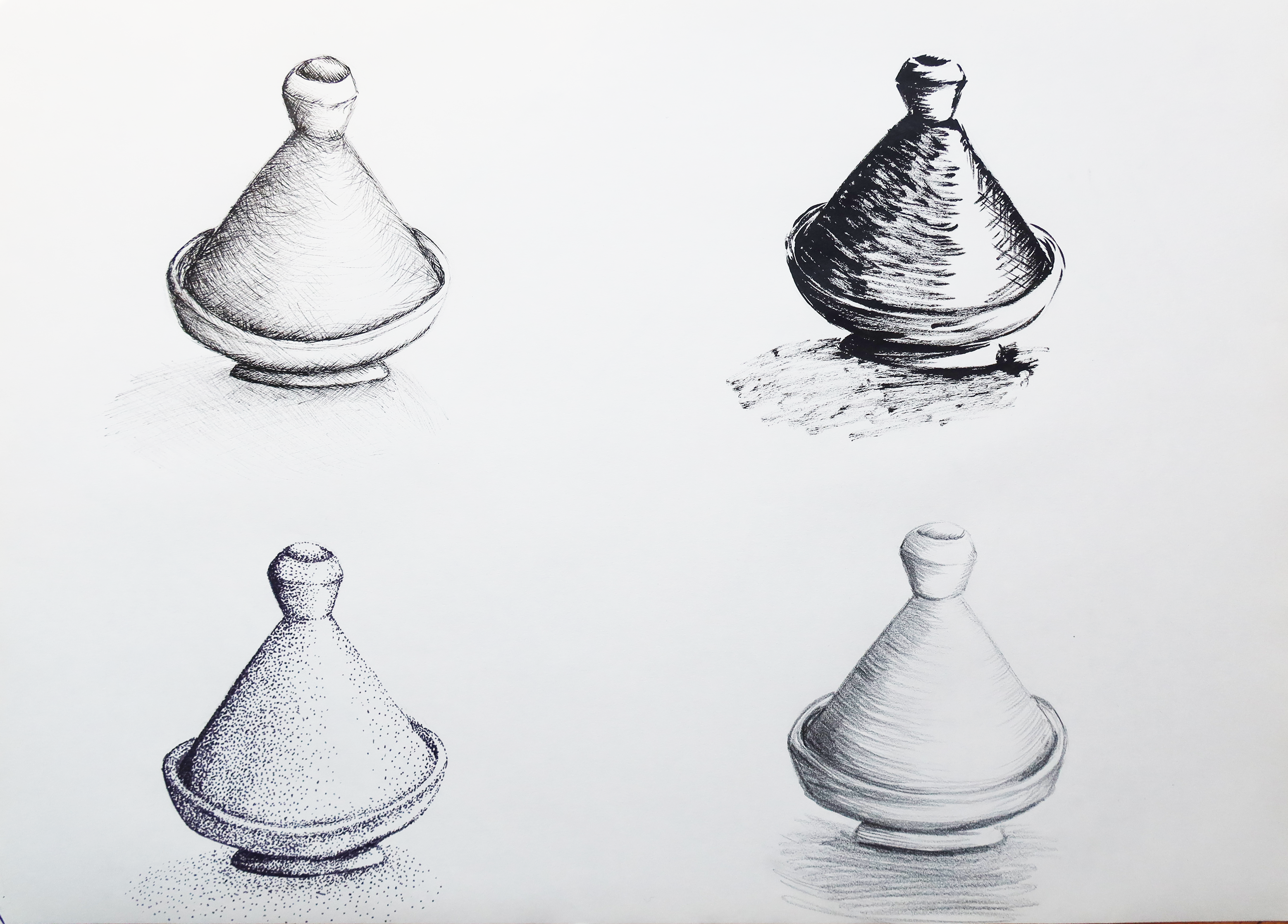
For this exercise, still on tone and shadow, I was asked to explore rendering this with lines, hatch, cross-hatch and stippling.
I chose one simple object to do some trials with different media and chose a small decorative Moroccan tagine pot and came up with the below. We were told not to focus on accuracy but on the tone and method and so I tried from top left to bottom right: (i) drawing pens with hatch and cross hatch: (ii) ink and brush with more fluid and thicker strokes and hatching: (iii) stippling with a think grey marker pen and (iv) normal pencil with just using curvy lines.
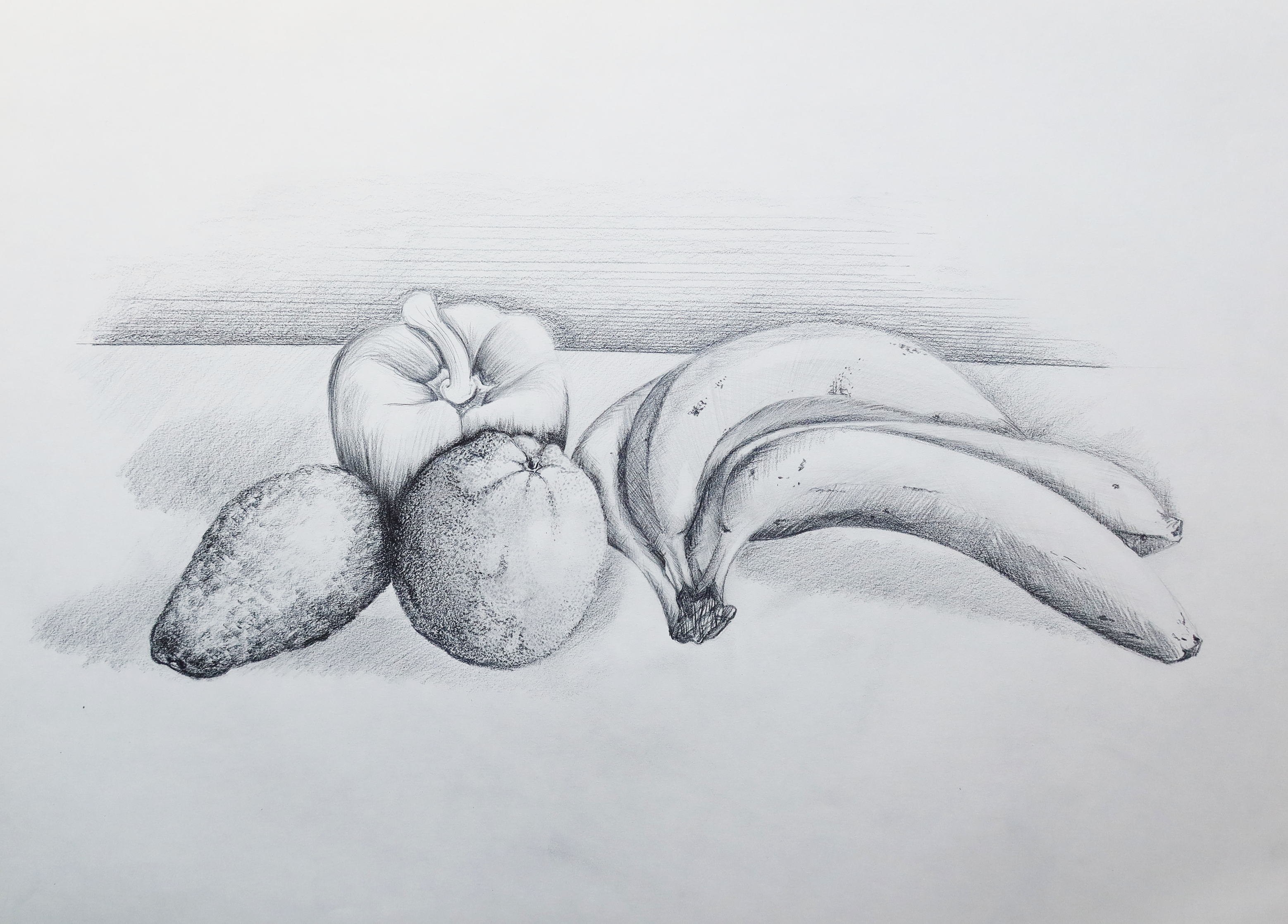
I was then asked to arrange a few objects together in a composition and render it using these methods. I chose some nice fruit and veg, realising how few nice decorative objects I have in my flat! I made a light line drawing just enough to render the 3D aspect of the drawing and then filled in the tone with different techniques. I chose very light cross-hatching and hatching for the bananas to keep them smooth and give the shadow of their different sides. I chose very fine stippling for the orange to give the texture of the rind and the little pores. I used a different stippling for the avocado to get the rough look of the skin by stippling with a soft pencil on its side, not using the point which worked really well. I then used curved lines for hatching for the pepper to get the nice rounded and full curves.
I then used thick pencil on its side for hatching for the shadows and a light line for the table end behind the objects with an additional horizontal lines that progressively got wider apart as they moved up to fade into the paper.
Thinking back on this exercise and the previous one looking at tone and shadow, I found it easier to follow the shadow and tone in the previous one given that I had a specific light source to one side that was strong. It made distinguishing the primary light from secondary light a lot easier – as did the fact that the objects were simple and smooth.
For the above drawing, I used natural light which was a bit harder to gauge and which changed as I was drawing though still came in from the right hand side through a window. I also find it harder to do tone when the objects are different colours – as sometimes the shadow and tone may appear darker or light depending on the colour. At the same time, the different textures of the fruits and veg also made it harder to distinguish primary source and secondary source light. With the above, I think now I could probably have darkened the red pepper more to give it a glossier look and a darker finish. I could also perhaps darken the surface of the table more and better ground the objects.
These exercises have definitely helped me look more carefully at objects to understand the tone and light better and have helped me do better drawings by really focusing on form and not the outline – although I still find it hard to draw directly in tone rather than be guided by some kind of outline.
