For this exercise I collected some objects with different surface textures and capture the textures in my sketchbook. I was encouraged to be free with media to do so. I was asked to divide a large A2 or A1 piece of paper and work in the different sections. I decided on:
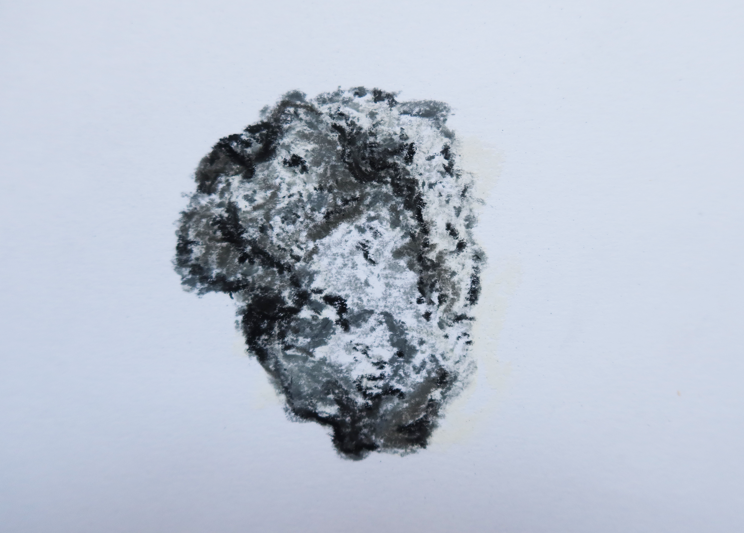
(i) a piece of volcanic rock. For this I used charcoal and pastel and the stippling method to get a dusty and rocky approach. This worked well to get a grain and I used different greys and blacks to get tone and contrast. I think that ink pen could also have worked for an even more precise look but perhaps with less character and depth.
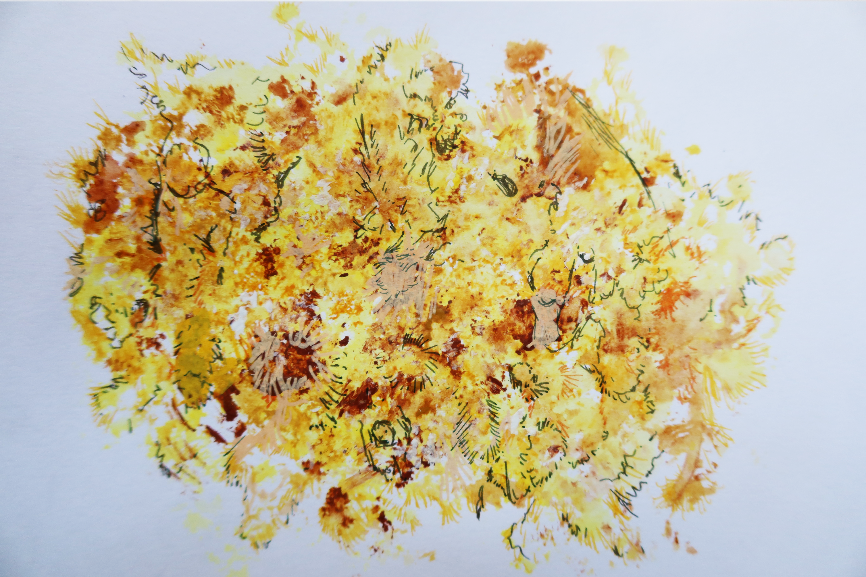
(ii) a sponge. I found this hardest to capture due to the peculiar form it had. I decided to actually use the sponge to dip into acrylic paints using different colours from light to dark to get the spongy effect and then ink pen for detail on top as I dont think it quite worked the way I had imagined. I think I used too much paint on the sponge and so the airy holes were a bit lost. However I do like the texture and build up of the paint. The edges could have been better defined but the texture works really well.
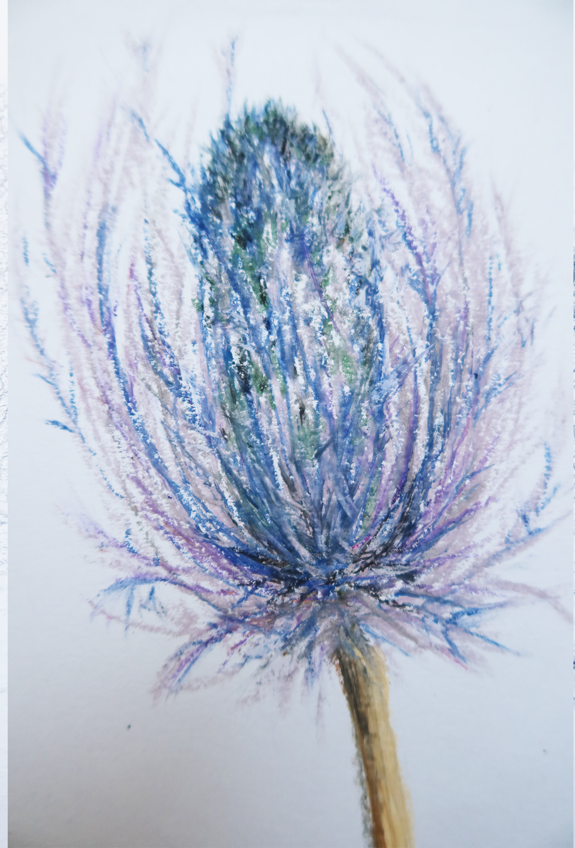
(iii) a dried thistle. For this I used oil pastels in order to get that whispy and rugged look and this worked well and is my favourite of the four. The bristles were so delicate yet rough looking that the oil pastel worked really well for this texture. Sweeping linear marks for the longer parts of the flower and shorter marks for the thick centre helped contract the density of the centre with the wispier exterior parts.
(iv) a piece of leather. For this I used a very light and well sharpened pencil for to get the fine lines and smoother look. I drew scribbly light lines to capture this. Getting the little diamond shapes of the leather texture was time consuming and as I did it I changed approaches from being more precise to trying a shakier and lighter hand and pressing harder and lighter to get the light and dark effect.

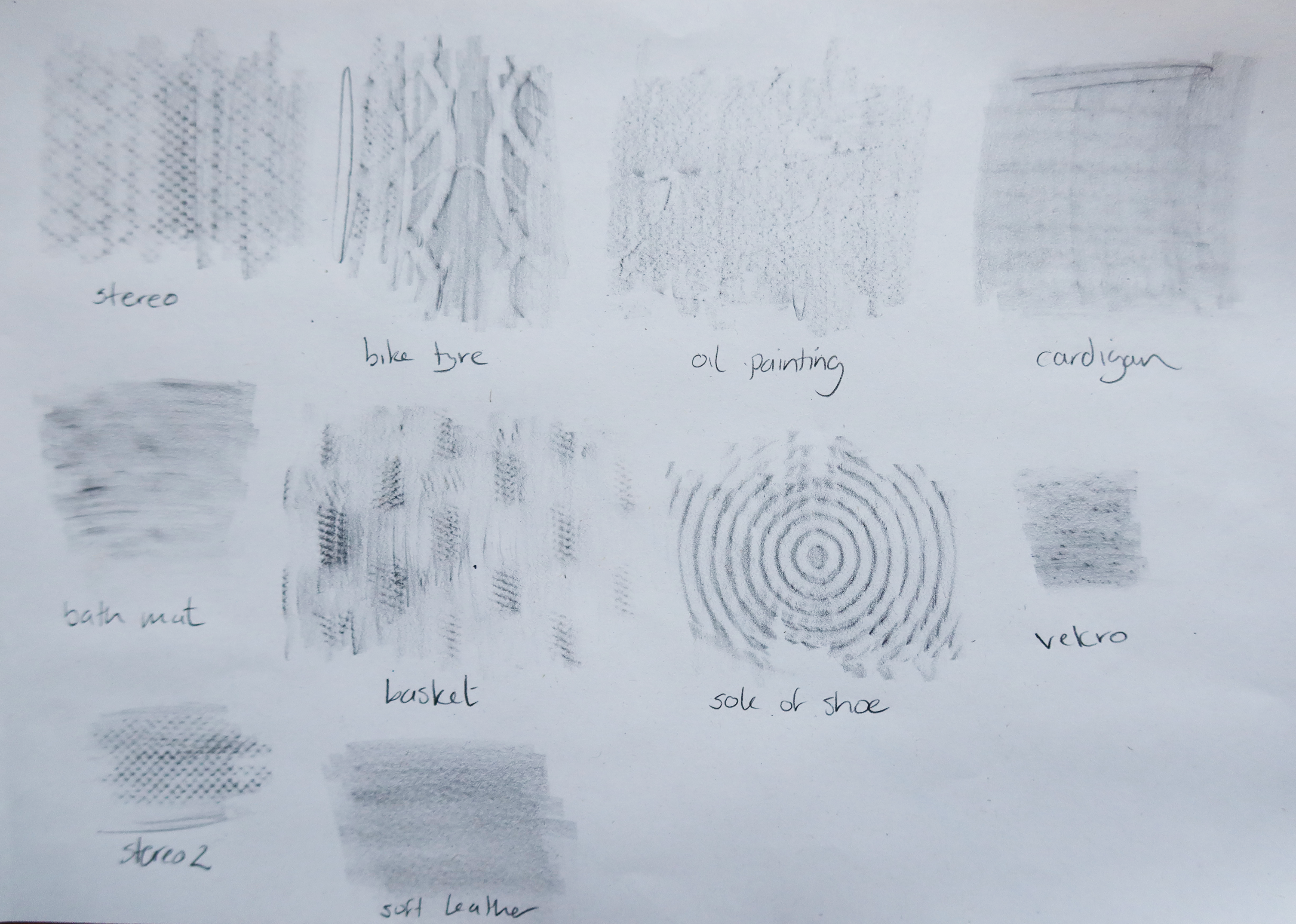
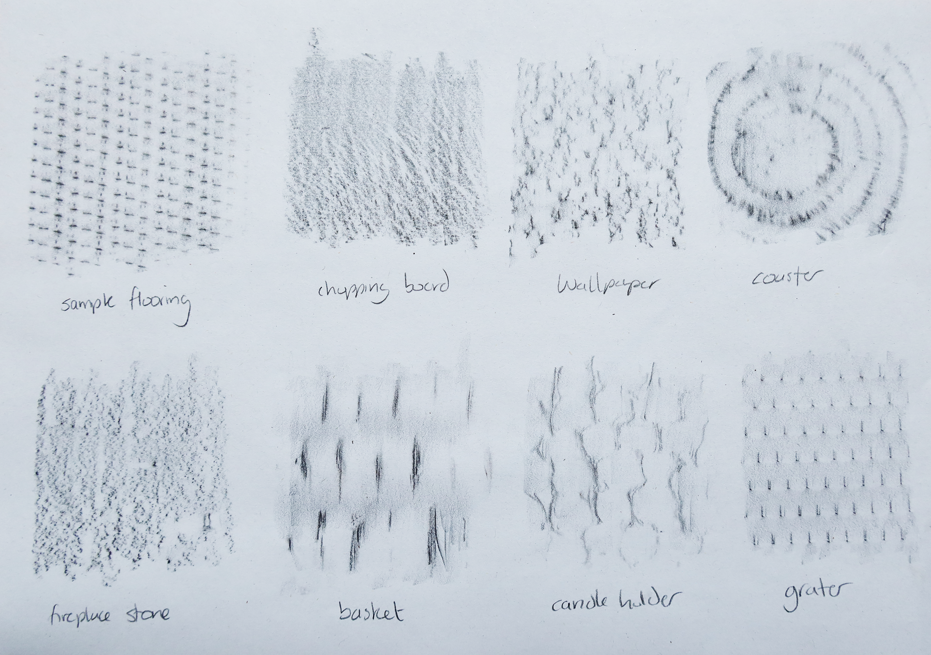
I was also then invited to experiment with frottage on different surface textures and came up with the below. I was surprised by a lot of the nice textures that came out! The stereo is from the netting around the speaker, the oil painting that I thought was very textured was actually a bit flat and the basket would make a nice print! I also really like the grater and candle holder effects – almost symmetrical and neat as a pattern.
REFLECTIONS:
I really enjoyed this exercise and the surprising textures that came up from the frottage in particular. It forced me to think of different ways to use mark-making to create texture too. Using different media in this regard was also new.
