For this exercise I was instructed to buy a newspaper with a supplement and go through it to identify and cut out any article that contained an illustration and analyse them as to how it relates to the text, how the ideas relate to the meaning of the piece and how it extends to the content of the piece and also what kind of illustration it is.
I was at the airport and so perfect for a browse though I didn’t find many for newspapers so I went through the mags section and found three magazines/papers that had a quite varied focus areas and illustrations. I have photographed and analysed these as per the below:
Payot: Literary magazine
This edition from January-March 2021 is the literary magazine for a book store in Switzerland called Payot.

Above: This is the editor’s letter at the beginning of the magazine which explains what the edition contains, including a special piece about a writer called Marie Ndiaye. The illustration is clearly fully linked to the title: ‘How to spend winter under a duvet’ – please forgive my loose French- English translations! The illustration around the article for me is quite abstract and brings together a cold and hot block colours of blue and red which is quite symbolic of the cold winter but the warmth of being under covers in bed. The blustery black and white line drawing which seems like a sky with dramatic clouds also brings to mind the wintery weather.

This illustration goes with an article that presents different literary works for adults that use animal characters to set the scene of their story. Contrary to the idea that animal stories are more for children, the title of the article is a play on the word ‘beast’ and the phrase ‘not so daft/silly’ or ‘not so beast’ very literally translated! Thus the illustration is likely from one of the books being discussed. Thus it is more of a usage of an existing image to really create the link to the title about the ‘beast’ and of course, is a dangerous looking feline rather than a cute little bunny rabbit which just wouldn’t have quite the same effect!

This is a gorgeous illustration for an article about various young black and minority ethnic female authors that have written successful books around race, feminism, sexism, segregation, slavery and more. The article talks about the authors, their lives and the books they have written and the illustration is very representational of the diversity in race and ethnicity as well as the diversity of the topics therein. The bright colours, empowered look and different patterns just help convey the positive words and messages around diversity these young and brave women are bringing to the world by sharing their stories and injustices.

This lovely collage of images and textures fits very well with the article called “Sewing 1; waste 0”. The message of this article is how many people are starting to do their own clothes repairs or making clothes out of old clothes – all in the new age of trying to recycle, have less waste and eventually ensure we save the planet somehow. Here’s hoping! The very fact they used a ‘stitched together’ collage style was very emblematic of the DIY sewing approach, with a little set of stitches and a sewing needed bringing together relevant photos and fabrics.

This article is entitled ‘future woman’, and is about how female writers are carving a space in the mostly masculine world that is writing for science-fiction. The illustration is a little abstract but also representational, clearly featuring an empowered woman looking up in an inspiring sense, moving towards something – in this case a career in science-fiction! She is decidedly not too feminine, yet very feminine, with short hair, piercings and a determined look that really fits the storyline.

This article is called ‘my brain, my companion’, and introduces the concept of how the brain works and how it shapes us and how we shape it and presents a series of interesting books on the subject.
The illustration clearly represents a brain but also the neurons and synapse routes in a complex and colourful way that is messy and reminiscent of life as we know it. I really like it!

This illustration is a light, decorative and conceptual illustration with a simple wavy faded print in blue flowing sections around the text which represents the relaxing exhale which comes from a small female character sitting in a meditative state. It goes with an article on yoga and breathing exercise books. The blue is a nice calming colour that goes with the zen concept and stays simple around the book covers selected to showcase the books being mentioned in the text.
Swissquote: Finance and technology magazine
This edition of the magazine looks at the impact of COVID-19 pandemic in general but specifically also in Switzerland and gives advice on how to look after finances in this particularly scary global pandemic we are currently experiencing.


This long-page article provides an insight for investors on how the stock market should rebound for the better in 2021 and how the different markets in the EU have faired against the Swiss one. Its a simple and bold representational illustration using piggy savings bank, gold coins and bright and positive pink and yellow colours reflecting the economic potential of 2021.
This accumulation of gold galleons continues into diagrammatic illustrations to show potential market trends, dividends from banks in order and the most profitable sectors as per the above. Simple and striking with a dark contrasting background.

This illustration is metaphorical and uses a character from a video game ‘angry bird’ to reflect on how investors are upset with the fact that COVID-19 meant that the businesses they invested in that got bailed out by the state were not legally allowed to continue paying them their dividends. Red and and a big angry bird face is all that’s needed to make it clear that investors are not happy!


This article is about the five ‘amendments’ of how to make good investments that get the best profit. The colour scheme is therefore rather sensible and simple and using objects like calendars, magnifying glasses, chess pieces and files conjures the ideas of the careful planning needed for good investing.

(Right side) This representative illustration brings in symbolic Asian lanterns as markers on a chart showing the Asian stock market trends going up – as an advert to promote the Asia-Pacific stock market . It’s a quirky concept that you immediately understand.
Charlie Hebdo Newspaper
This newspaper is filled with satirical political cartoons and accompanying articles about current affairs and politics.

This satirical and conceptual illustration on the front cover doesn’t even have an article, it doesn’t need to: how COVID-19 and the vaccine rush further highlights and aggravates the inequalities and poverty we see in the world today. Politically shocking, showing an African trying to ease their hunger stuffing his sad face with empty syringes. Powerful.

This illustration is a satirical metaphor on governments using a man whose arms are all twisted, incapacitating him and symbolising bad governance whereby the right hand doesn’t know what the left is doing! Funny!

This set of illustrations is a reminder of the previous cover illustrations some readers may have missed. They continue to be a mix of controversial images that are both representations and metaphorical: two suicide bombers impatient to see bars and restaurants open back up after COVID-19 restrictions, a white nurse claiming that even if we were to vaccinate the poor they are so thin we can’t find their veins or the main one in blue: an poor and starved African representing Africa, where humanity was born, as the last continent to be able to access vaccines for COVID-19…. poignant, sad and infuriating!
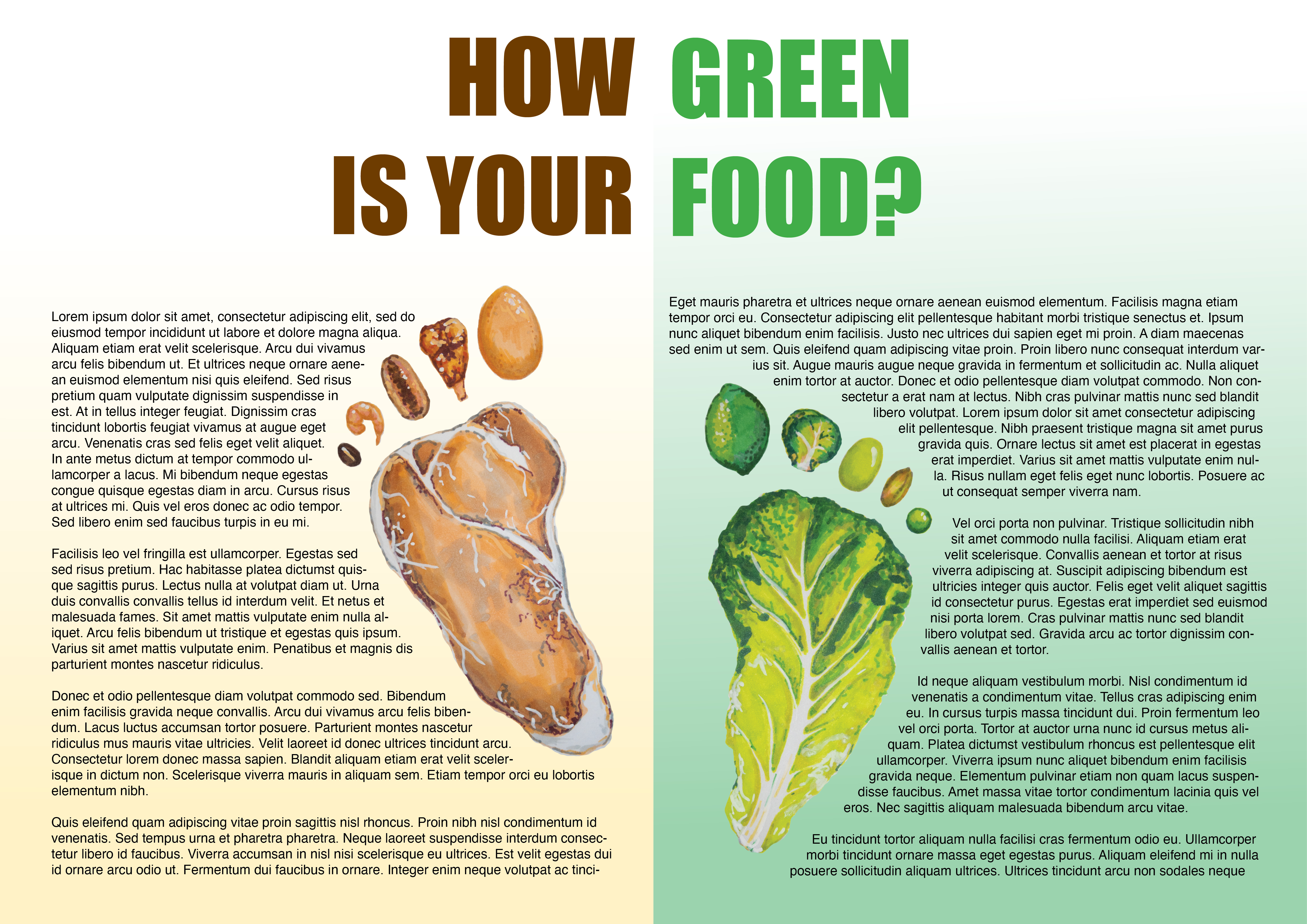
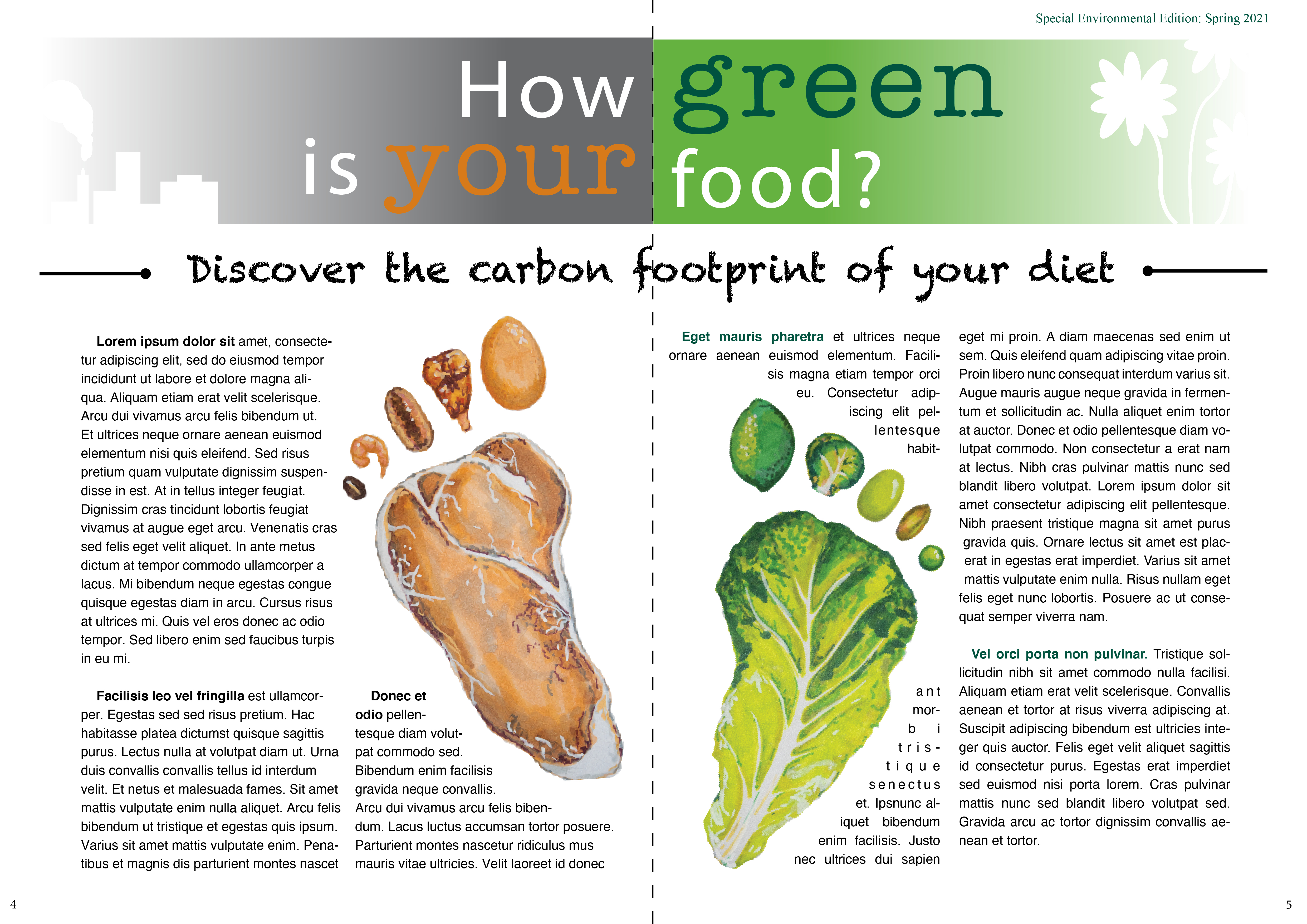
How green is your food?
I was then asked to pick a subject from a list to create an illustration for an editorial. I picked ‘how green is your food’ and found an article to reflect the essence of the title that I could use to help me plan my illustration.
I found one called ‘You want to reduce the carbon footprint of your food? Focus on what you eat, not whether your food is local’ from ‘Our World in Data’ website by Hannah Ritchie accessible here.
I read the text fully a couple of times and then read it again and picked out the main key words and phrases that really reflected the essence of the article.

I tried to make the connections between these words and how they relate to each other with a spider mapping approach. Then, once again I read the article and started sketching ideas for the illustration as a ran through it. I actually found this a really useful exercise to get quick and free flow thought coming, it really helped me make connections through words – which I now see is a great way for me – so used to writing and reading – can connect to my creativity – it was quite fun!
I came up with the below quick ideas:

I then jotted down what kind of illustration I wanted to create. I opted for something thought provoking – almost guilt proviking – a warning, set into a kind of choice, informational and with the idea to be persuasive about thinking carefully about how we eat in relation to its effect on the environment.

I then started doodling further ideas in small thumbnails and sketches to build on what I had already started off with:


I really tried to come up with different ideas although some ended up more generally related to the environment and with less of an obvious linkage to food so in the end I chose to reflect two ‘carbon footprints’ in the image of different types of good vs bad food for the environment that made up the footprint. This information comes from the graphic in the article where they rank how much carbon footprint each type of food has. I had a fun time trying to pick the right types of food that were the right proportional size so they would all be as recognisable as possible with a 10 toes kind of set up! To help I created a small reference board in Pinterest of the different foods I had come up with:

Based on this, I tried out some different types of food for the footprints and some thumbnail compositions for how it could look inside a magazine or newspaper supplement:


I then created the illustrations properly using alcohol markers and posca paint pens. I decided that this would be more vibrant than pastels or watercolours etc as wanted it to be quite bright and impactful.

I then uploaded these images onto Photoshop first to make sure the colours came out well and then transferred to In Design to start trying out mock ups in a magazine format. I started out with some colours and trials and realised it would look really great against a double page which would help give the idea of the two sides to green eating!

So I then played around with various mock up across double pages as per the below and started trying to refine the mock up as a magazine spread with text and titles and choose the best colours.
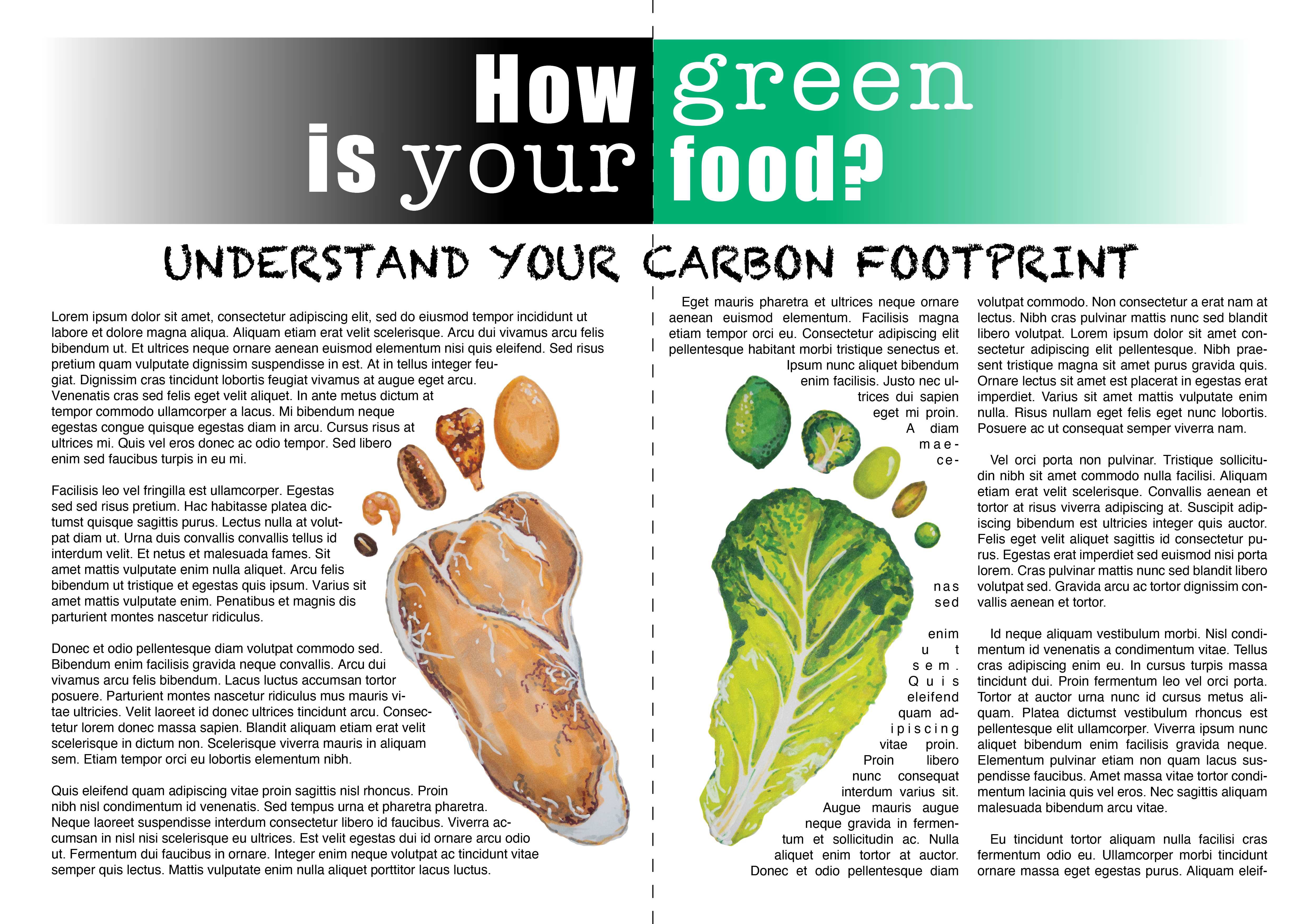
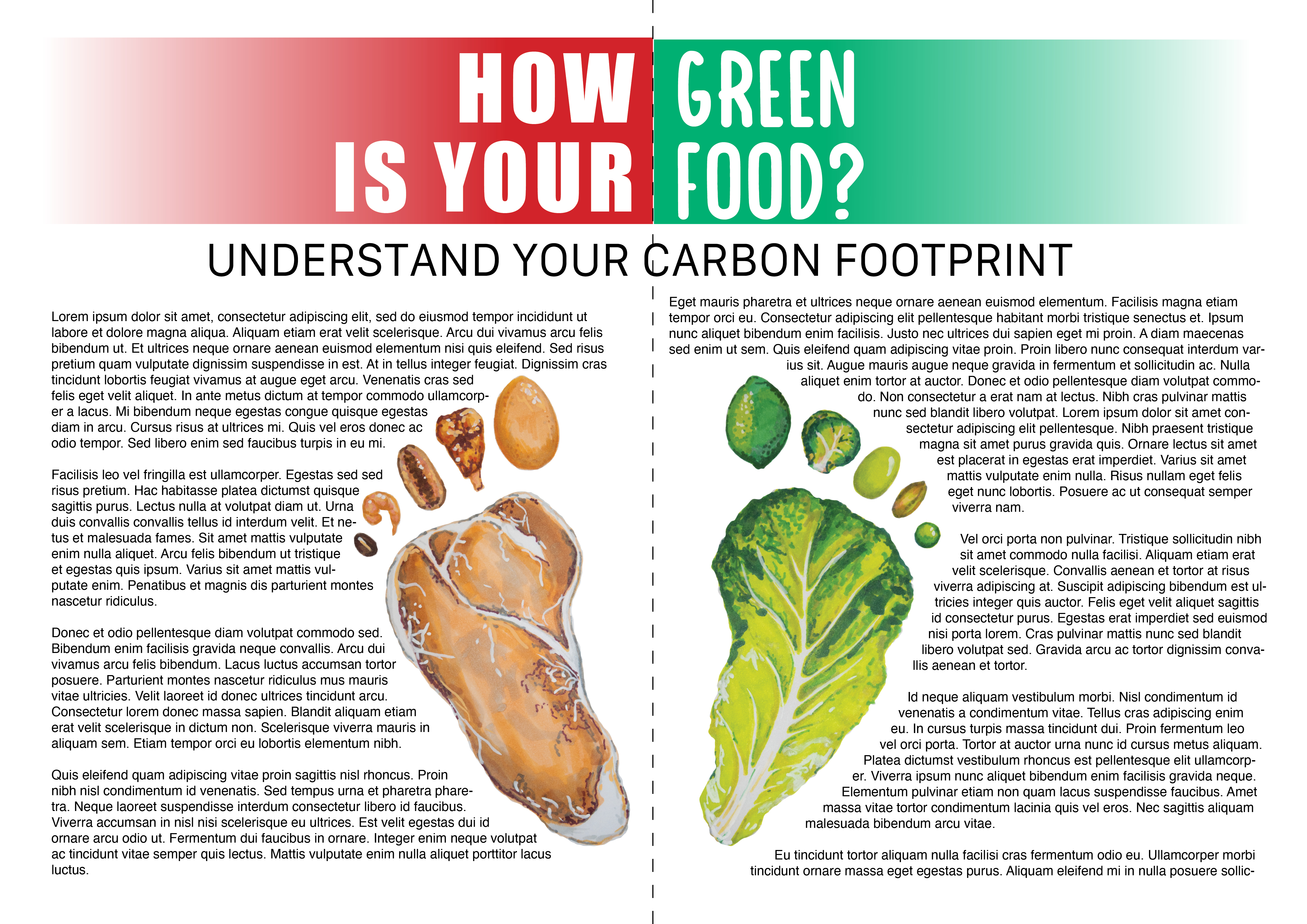
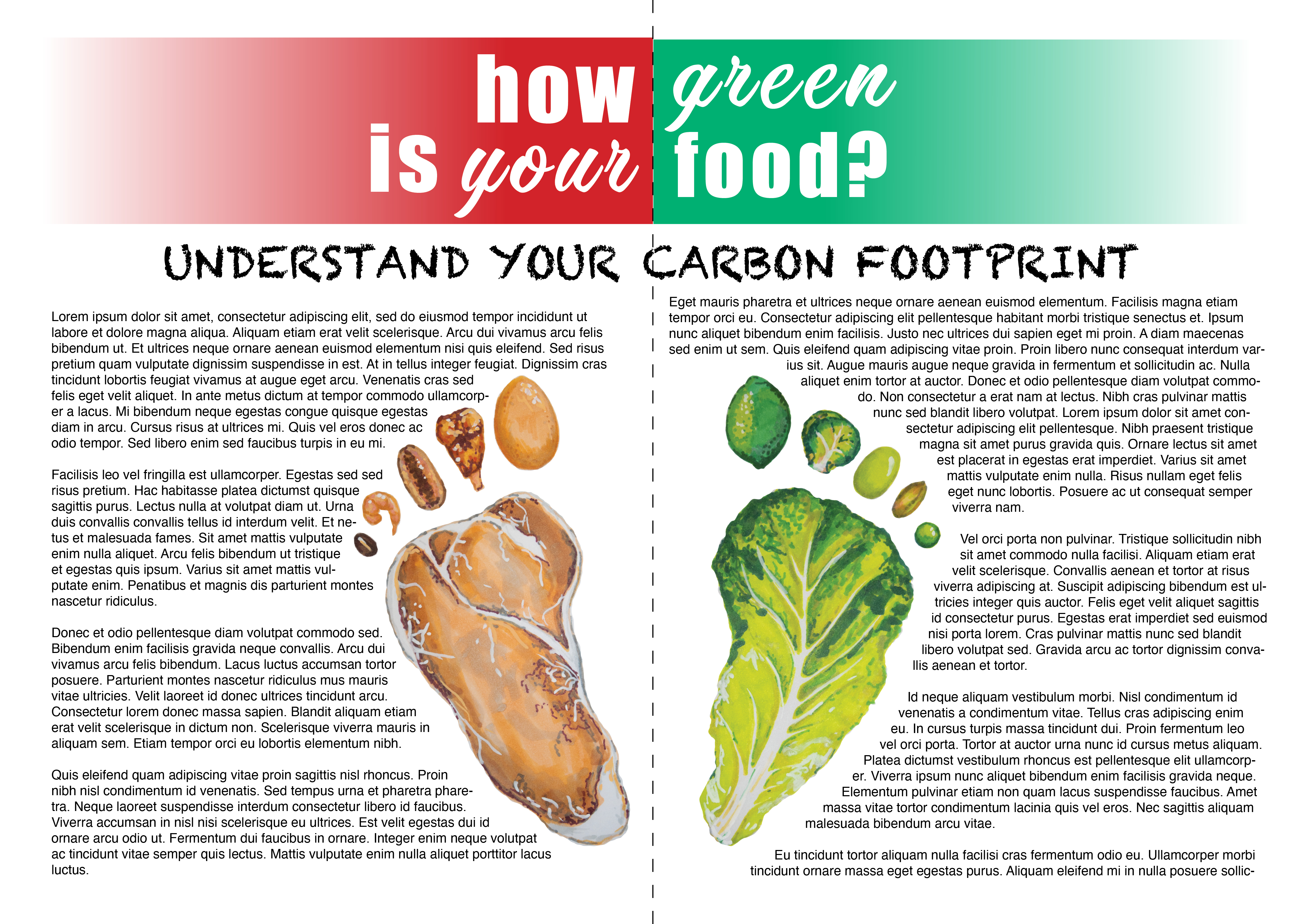


I tried different font styles, colour schemes and started to construct detail like lines with the subheading, adding page numbers, an edition version header. The red and green was a little bit too Italian flag and the black works well to symbolise black carbon and was a little more elegant. I tried more different greens, went back to a browner meaty colour and even tried grey as per the below and tried also making the footprints not entirely symmetrical too, for a more dynamic look and added more dark green to the title font.


With some more playing around I finally decided on the below final design and mock up, with slightly more elegant font and a colour theme of green, grey/black and brown/red – with some of the green and red brought into the text too. I also realised that the text was a bit too dense so I tried to make the margins bigger and made the line spacing bigger for a lighter and leaner look.
Final reflections:
I really enjoyed this exercise for both the topic and the chance to really come up with a mock up editorial with text. Having to analyse other editorials and images used in magazines and newspapers was really useful to help me think about how I wanted my own to look and feel and to also realise the importance of adding visual additions to text to really reinforce and add meaning and even more important, feeling and emotion. As I mentioned before, going through and reading while jotting down visual ideas and notes is really something that works for how my brain is set up and of course, is eased by the fact that there is text to do this with – which may not be the case for other types of briefs. I think I also find this kind of illustration more gratifying or meaningful for me personally – capturing the essence of words and key messages around an article which then adds to the experience of the reader on a topic close to my heart was inspiring for me.
