For this exercise, I had to go back through my past work, review everything (final pieces or not) and identify those I liked the most aesthetically or conceptually – without regards to the fulfilment of the brief.
Since COVID-19 continues to limit access to printing and offices and thanks to my online learning log, I created a Pinterest gallery online of all my favourite elements so far. This can be found here but I have also analysed these below.

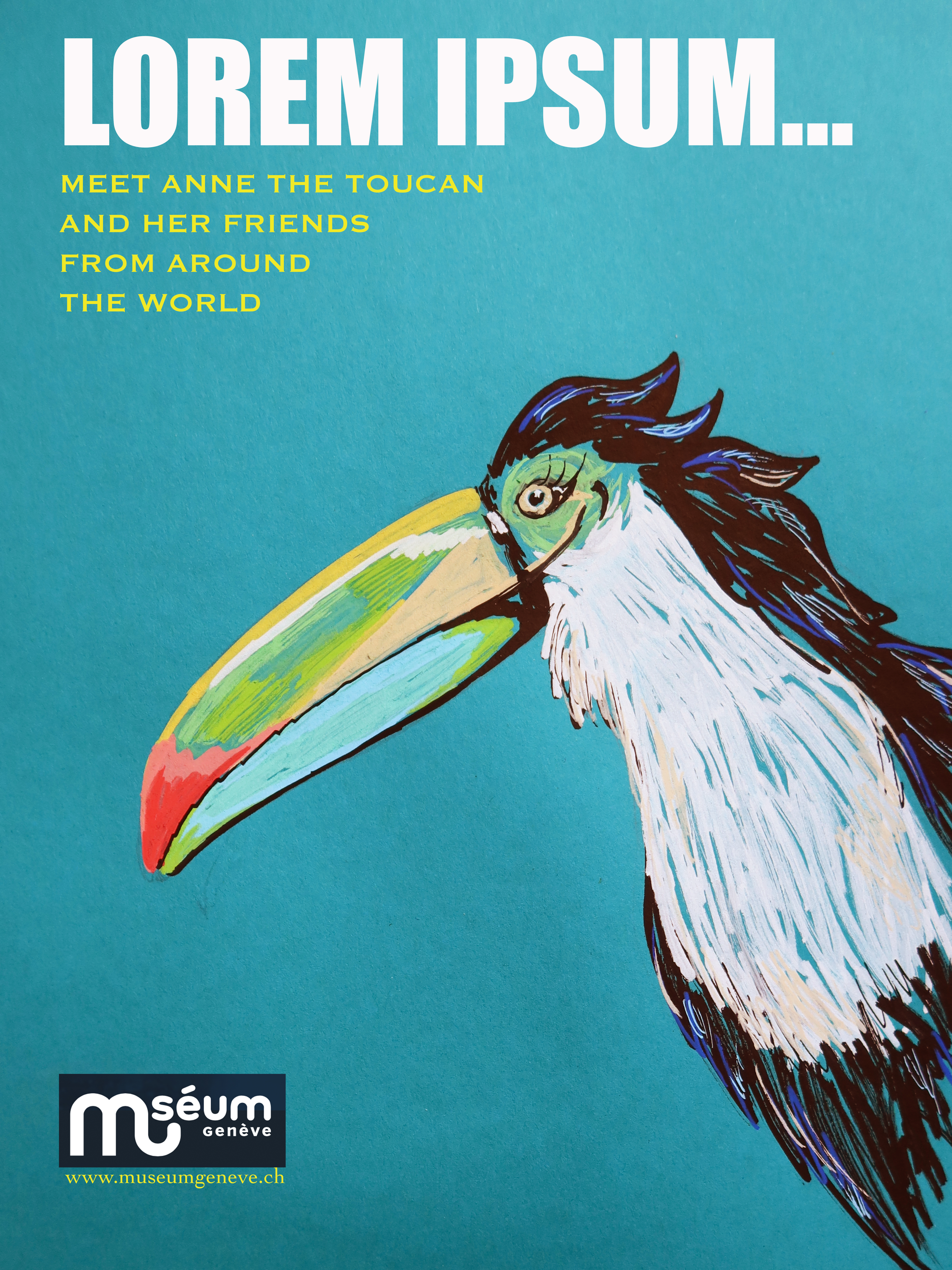
Above left: I really enjoy the concept of this from the perspective of what it was like for a lot of women in the 50s in the Western world. This is probably because, as a woman working in social justice issues, I also really enjoyed the research part of this exercise and it helped me bring a lot of meaning and thought to this particular exercise. Visually, I actually don’t have a massive love for the aesthetic of this kind of pop-art collage but I really enjoyed learning the ropes on Photoshop and ID and it was a lot of fun putting it together.
Above right: While I don’t like pop-art, I do like the furniture style of the 50s and the pastel colours and blues and turquoise and curvy cute products and so aesthetically, this is right up my street. I also really like the combined use of water colours and gouache paints with ink and markers that helps give it that almost fake and too-perfect 50s style!


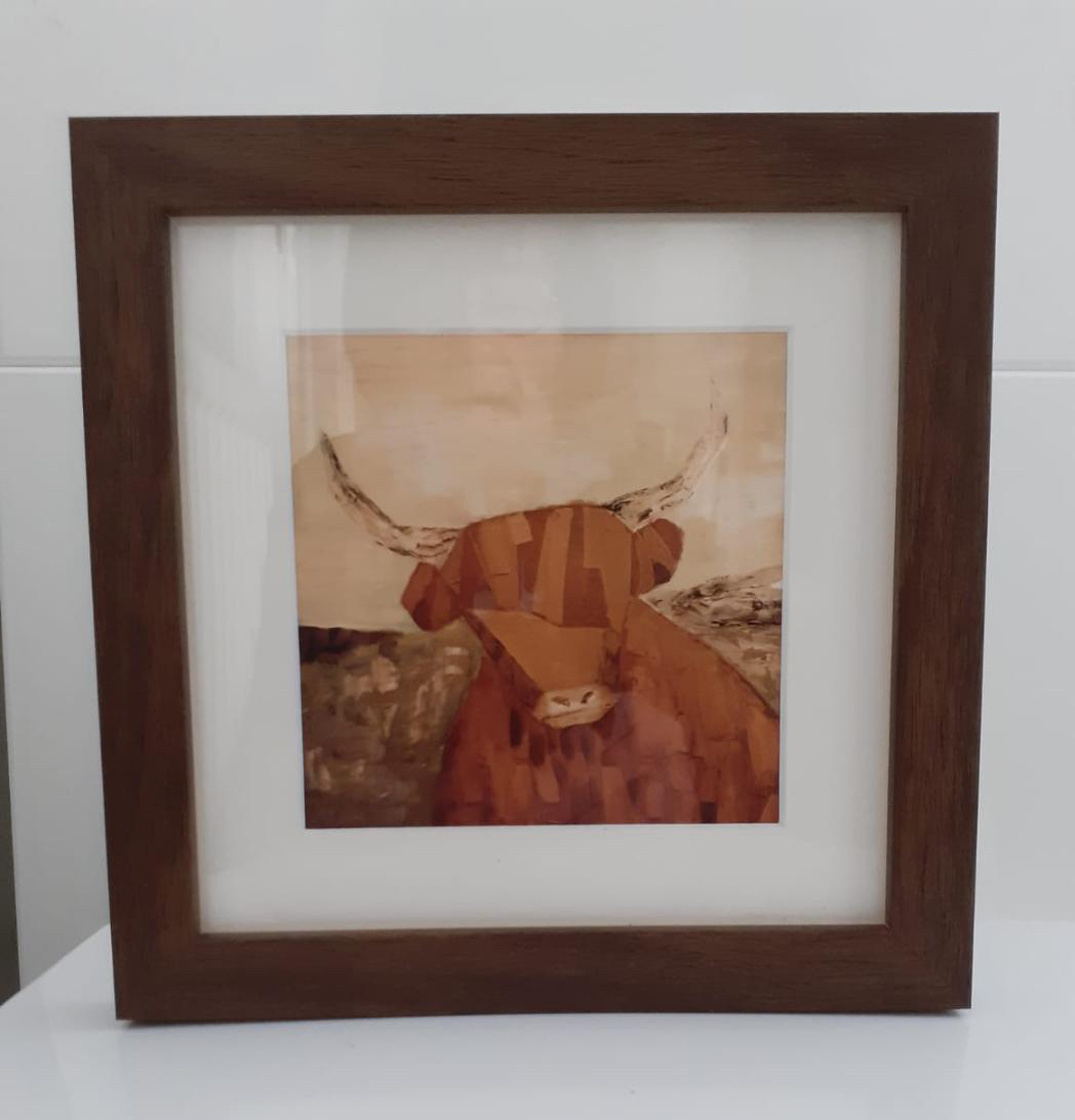
Above left: I just love the messy ruggedness of the main red cow in the top middle of the page. It’s fierce and fiery and I had a lot of fun playing with new tools on oil paint for this.
Above right: This is one of my favourite pieces as a painting in its own right. Since I opted to try my hand at oil paints, I went right for a proper painting on canvas. I love it for both emotional and aesthetic reasons: it reminds me of home, it has a nice chunky and steady character and depth to it, kind of like what you would expect your grandfather to be like – if I had ever met him (he died before I was born) and the colours in the cow really catch my eye.

Above: I really like how the cross hatch and messy mark making gave this little drawing a nice atmosphere, on top of greaseproof paper!

Above: Aesthetically, I like the shadowy, comic-style of this black and white piece and the geometrical shapes of the lighthouse.

Above: Although I didn’t end up using this trial for my point of sale display on fruit, I really like the stipple and overlay of colours!


Above left: I cant quite decide if I like the different toutous because of the mix of media à la Degas or the pastel floatiness of the image! I like the softness and messiness of the lines where I tried to give volume to the toutou.
Above right: The concept of the ballerina flying through the air makes me feel free and remember all the dancing I used to do before COVID-19 lockdowns!! The concept also represents a reaching, a possibility and a drive towards something which I find inspiring.

Above: I love this piece both conceptually and aesthetically. The texture and collage aspect was really something new to me but I really like the lightheartedness of it and the promise of a new dawn it reflects.


Above left: I like this for its concept, though it may be because I know that it was conceived listening to classical music trying to follow the quick flight of a violin but I also like the aesthetic of the various blue shades that remind me of the French riviera sea!
Above right: Even if just a simple drawing, I like the perspective and direction of the sunglasses!


Above left: Aesthetically, I just think these are fun colourful little characters which I did when trying out the animal children’s book with acrylics then ink marks.
Above middle: Aesthetically, I really like the texture I tried to bring in and especially the layers of fine lines to build the volume of her hair.
Above right: Can a guy be sassy? I think he is! I enjoyed both how this character turned out with his cocky attitude and lean and elegant form and the concept – thinking back to the many Saturday night evenings I have had online or with family and friends to jointly shout at the screen while watching soap stars and actors dance the night away on the Strictly Come Dancing TV reality show.


Above left: My favourite blues blended together in my favourite shape with a light touch of gold that reminds me of a greek island and the cheese that is Mamma Mia. Not exactly part of my course, but part of my extracurricular explorations.
Above right: I have been drawing little Christmas characters and objects for years and creating cards so the concept for this has been a years-long process since I was a kid. I enjoyed refining them and using my new found skills with water colour and ink – simple drawings that reflect a young girl’s view of the traditional Christmas cheer!


Above: I created these greetings cards on the basis of my dragonflies from the one of my first exercises. There isn’t much concept behind them except to be elegant and aestictically pleasing to the receiver of the cards but I like the light airy fairy water colours and ink pen touches. I simply did these straight off as a set of birthday greetings cards to send to some friends.
Above: Aesthetically, I like the scribbly lines of bright colour, the blue highlights on the black and the cheeky grin.
Authorial production
After this analysis, I was asked to then select one of my pieces to take to full production as an authorial piece of my own choosing, rather than based on a brief. I chose to create some kind of decorative print of my highland cow. After checking various options for online printing, creating posters or framed photos, I found a great option to print a photo and frame it all in one. I decided that this could also be a good belated Christmas present for my aunt and thus worked on it in Photoshop to create a more Sepia effect so it would match the colours of her interior. I also decided to make it square and really more portrait-like with a bigger focus on the cow’s head.
I came up with the below final result, with a good quality wooden frame and white trim:
Final reflections:
It’s really great to go back and look at all the work I have done and think about the results and the processes and what I have learned. I am really glad to have tried out so many new media and different types of illustration – from tattoos (would never have imagined) to posters and from cards to logos. I still want to get better at using digital software so I will keep experimenting with that and I think I am most surprised by my reaction and love of using collage and oil paints, which I have never attempted but have worked well for me in my exercises. This shows me that I need to get over the hesitance I sometimes have in trying newer things and really allow for the exploration and experimentation that this course calls for so I can really develop my practice.
