For this exercise I was instructed to find a range of illustrators who use a particular medium and to catalogue them according to the similarities in the was that they use tools and materials. I chose illustrators who used pen and ink as I wanted to get more practice using this and I have bought some new ink pens to try.
I found nine different illustrators both modern and older with different styles of using pen and ink that I was drawn to though of course, many of the illustrators/artists did works beyond this medium too:
- David Stone Martin: 1913-1992, American and best known for his illustrations on jazz record albums:


2. Edward Ardizzone: 1900-1979, English artist, writer and illustrator who used a very lovely organic cross hatch in his ink drawings for children’s book (and many also with water colour).


3. Sarah Maycock: Modern illustrator graduated and based in London using ink and represented by a new UK based illustrators’ agency Handsome Frank.


4. Matt Hyunh: Modern Vietnamese-Australian visual artist and storyteller. His bold brush and ink paintings are informed by calligraphic Eastern sumi-e ink traditions and popular Western comic books.


5. Stuart Patience: Modern freelance illustrator based in London working with a lot of detail:


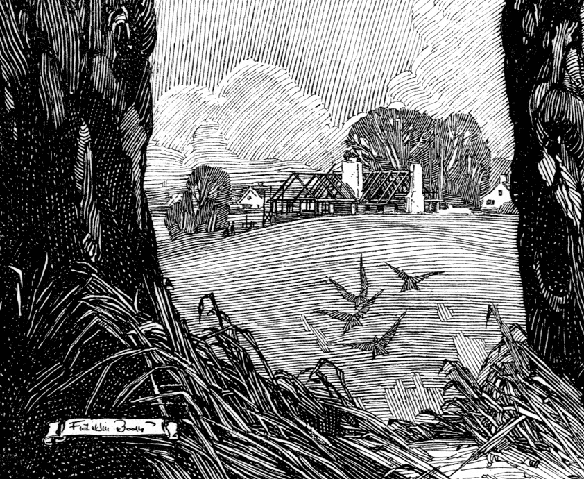
6. Franklin Booth: 1874 – 1948 American artist well known for his pen and ink illustrations and even did wood engraving illustrations with pen and ink.


7. Andrea Joseph: is a modern self-taught artist living in Derbyshire, England, who creates amazing, one-of-a-kind drawings using simple materials like ball point pens


8. Lucinda Rogers: works from life using pen and ink, recording straight from eye to paper, with a focus on bustling city life.


9. Gerald Scarfe: Modern illustrator, born in London and an established satirical cartoonist. Uses pen and ink but combines with other media like pastels or crayons etc. He has some crackers about famous politicians 🙂


I was then asked to catalogue them by the way they use tools and materials so I created the below three main categories:
More traditional use of pen with line or cross-hatch markmaking in black and white
For this category I would put Edward Ardizzone, Franklin Booth, Andrea Joseph and Stuart Patience. Ardizzone used classic pen on paper with organic and messy cross-hatch to create quite a mystic atmosphere while Franklin Booth uses light and darker lines to create hyperreal images of stunning detail. Andrea Joseph uses biros and ink pens to also create realism though this is combined with compositions reminiscent of an artists sketchbook with notes or intertwining drawings. Stuart Patience has a classic line and fill approach with purely black and white extremely detailed drawings.
Ink in black and other colours using brushes and combined with pen lines
I would put Matt Hyunh, Sarah Maycock and David Stonemartin in this category as they use different inks with brushes and water to create different interesting tones and strokes and adding colour while also combining with pen lines to create spontaneous images with a lot of light, movement and character.
Base of thin and thick pen lines and adding splashes of colour with ink brush or other media
Lucinda Rogers and Gerald Scarfe use mainly black pen line or ink strokes, in different thicknesses to build their images and then add patches of colour or fully colour inside the lines using ink and in the case of Scarfe, many other media. I was struggling to really categorise Scarfe since as a cartoonist it really is a specific style of drawing but I think it fits best here.
Objective vs subjective
Ardizzone, Andrea Joseph, Franklin Booth are all very objective in their styles, creating very realistic and detailed illustrations. Stuart Patience also has realistic drawings with excellent detail though uses these to create images that are ‘abstract’ in the sense of the combination of subjects in them, their poses and what is happening to them – a very nice contrast which gives him a very unique style. Sarah Maycock and Matt Hyunh still create realistic drawings that are clear in what they represent but their style takes them into a subjective impression with simple and bold strokes of brush that are whimsical and realistic at the same time. Stunning. I wouldn’t class any of these illustrators as having an abstract style but David Stone Martin definitely has the most ‘subjective’ approach with some elements of abstract in how he draws people and musical instruments with classy lines and splashes of colour suited to the jazz albums he was most famous for illustrating. Lucinda Rogers is a close second in terms of subjective drawing as she works from real life in busy cities capturing buildings, transport and people in simple strokes with a lot of character and movement and splashes of colour here and there that are playful and light. In a class all on his own is the cartoonist Gerald Scarfe who clearly uses caricature to distort images and mock politicians and global issues in genius ways.
Satirical
Matt Hyunh works on a lot of comics but has done some work to satirise the walls and fences separating countries and making migrants’ lives increasingly difficult across borders. Simple but effective (see man against wire fence above). Of course, Gerard Scarfe is a political cartoonist and only displays satire in all of his fantastic work! Stuart Patience is the third and last of the illustrators that have satirical or political messages to share with not-so-easy to understand strange compositions and such a level of detail that the drawings bring you in to study them in their minute detail.
I was then asked to chose one of the images that I most appreciate visually. I chose Lucinda Rogers’ ‘The Lizard’ as per below:

She has many other more colourful and larger illustrations but there is just something so simple, elegant and striking about this one in black ink only. The image is composed of a narrow viewpoint of a garden or field wall with vegetation on top and a small lizard running down it. The wall takes a good two thirds of the illustration and given the thick brush strokes it’s what draws in your eyes first but then you get taken up to the dainty detail on top with the grass and flowers and then all of a sudden you find the Lizard- despite the illustration being called the Lizard, its the last thing you spot but I believe this was on purpose and almost challenges you to find it in the detail – quite how you would when walking along in the country side and trying to spot the little critters who are so adept at blending in. I love the contrast between what I believe is larger paintbrush strokes to carve out the bricks in the wall and the fine liner/brush strokes of the more dainty flowers, grass and lizard on the wall. While it’s a simple line drawing, the distinct different thick or thin strokes gives her style away nicely. The think strokes of the brick are definitely more exaggerated and distorted but this gives such a rugged and natural look that it really gives off the mood of nature and peaceful countryside. I was asked to replicate this style in a re-take on one of my own illustrations and decided that I would use my black and white lighthouse at the Bains des Paquis in Geneva.

However, I did decide that to mimic best the style of The Lizard I would have to really focus on the rocks and the lighthouse itself with no beam, making it vertical, simpler and taking out the background etc. Before getting to the illustration I raided my favourite art store in Glasgow and got a Japanese ink pen, acrylic inks and black Indian ink that can be watered down and a few new paintbrushes to add to the collection and thus tried out quite a few different strokes and things with them to then decide how to compose the new version. I got a mop, a sword, dagger, some riggers and a big funky chunky one that I couldn’t figure out its name – having spoken to the shop assistant who clearly knew his brushes and which ones were good for retaining ink longer etc.


I then did some planning and trials to figure out which brushes and pens to use for what, playing around with different strokes and marks:

I then finally bit the bullet and went for it with the lighthouse and got the below result! I do think it mimics well her style and I used fine ink pens in different nib sizes for the delicate lighthouse part then a Japanese ink pen to get the rougher rocky parts. There is a difference given that the flowers in the original are more organic and the lighthouse more symmetrical but I really like the simple yet contrasting effect it gives. Studying this and replicating a style is really helpful as it takes me out of my comfort zone and into thinking about how other illustrators work.

I was then asked to repeat this process with a second illustration and this time I chose Matt Hyunh’s heron illustration.

It is a simple drawing of the elegant whooping crane in flight in black ink but with tones of grey introduced through diluting the ink. He has used a mix of different sized paintbrushes and has a tendency to use very large strokes to create one specific part of his illustration. In this one I just love the neck and head of the crane, clearly done in one fell and elegant swoop. Really striking. He then uses other thinner brushes to do the same to mark the from of the wings really cleanly and then the rest of the bird just merges into messier marks of different sizes to create the textured, feathery natural look which helps give movement to the flying bird. The end of the wings get darker to contrast with the white of the ‘arms’ of the wing and it gives a really stunning effect. There is no specific distortion to the image but the natural and loose strokes and marks do give an elegant simplicity that I think really suits the subject.
I decided that I would render my flying ballerina in the same style as it was the most suited illustration I have done so far and would hopefully allow me to try to have the same elegant strokes and movement and feathery, flighty look as the crane.
I had a lot of fund playing with the paintbrushes for this one, rather than using pens that I thought would be too strict and rigid. Particularly using the dagger gave a lot of room to get flowing one movement lines like the crane e.g. with the ballerina’s leg and arms and the flowy part of the tutu. I think this style on the ballerina gives it a more dramatic effect from my original. The only thing that might be limiting the style is that my illustration is a little more detailed with more going on and perhaps it might have been better to lose the cloud and feather and keep the simple movement of the ballerina. This can always be photoshopped out 🙂

Final reflections:
Having never really used ink with paintbrushes, this was a great exercise for me to discover more methods and mark making. I really enjoy ink and building on large and spacious brush strokes which I have never really done and it was quite a liberating way to interact with the paintbrushes.
Comparing different illustrators using one type of media was also extremely useful to help really analyse different styles and refine my analytical skills. I often find that I look at art and think that it would be easy to replicate, and that is sometimes the case, but what is not easy to replicate is clearly the originality of the style, the choice of what to include, what to leave out, what to allude to, how to use the materials and get certain effects. It is a great way to better understand the design process behind it all.
Looking at how I did my two illustrations: Since one of my replicas was more landscape and another a person, I realise that I find it easier to be more ‘free’ or creative with my mark making when its not a person. I get a bit stuck on trying to ensure the correct human form and not distorting it too much so that is something I need to work on more, as I continue to try to get more loose and flow with mark-making.
References:
https://www.creativebloq.com/illustration/pen-and-ink-41411203
https://makingamark.blogspot.com/2010/06/artists-drawing-in-pen-and-ink.html
David Stone Martin
https://en.wikipedia.org/wiki/David_Stone_Martin
Edward Ardizzone
https://en.wikipedia.org/wiki/Edward_Ardizzone
Sarah Maycock
https://www.handsomefrank.com/illustrators/sarah-maycock
Matt Hyunh:
http://www.matthuynh.com/folio/h3nqj5lxdl7xg03f4uzwpe3g1an4nh
http://www.matthuynh.com/folio/18t0i9jd4zax9p5acgiozqpj1nvmu0
http://www.matthuynh.com/folio/18t0i9jd4zax9p5acgiozqpj1nvmu0
Stuart Patience:
https://www.stuartpatience.co.uk/House-of-Epicurus
Franklin Booth
https://en.wikipedia.org/wiki/Franklin_Booth
Andrea Joseph:
Lucinda Rogers
http://www.lucindarogers.co.uk/illustration/the-independent.php
Gerald Scarfe
